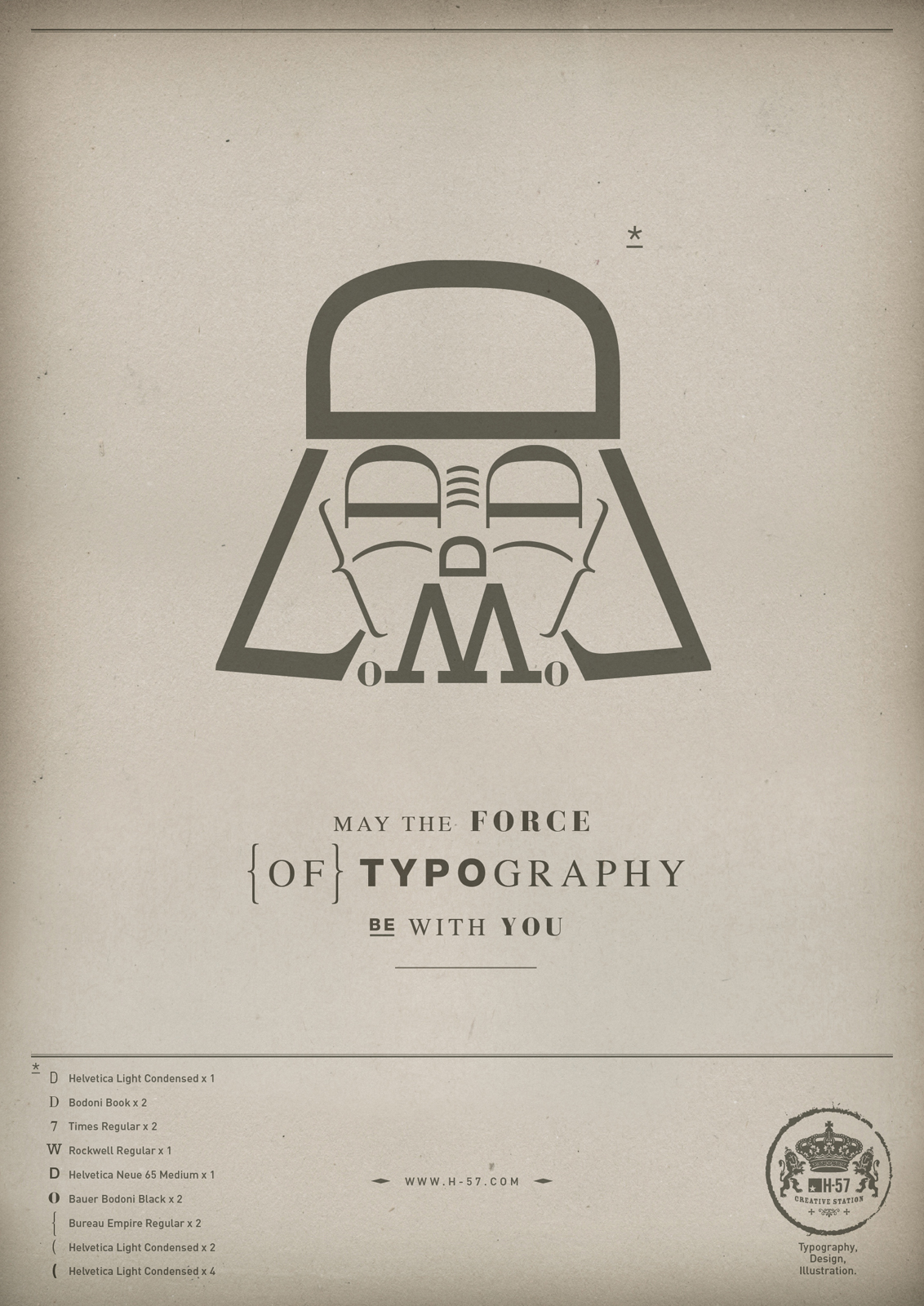
This is an essential guide to growing a font, or choosing a beard. Should you wish to do either.
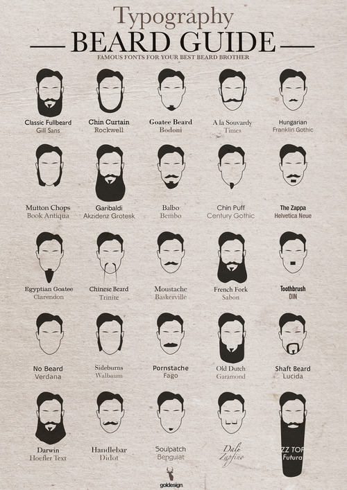
Designed by Typostrate.
This is an essential guide to growing a font, or choosing a beard. Should you wish to do either.
Designed by Typostrate.
Here’s a cool video about font maestros Hoefler and Frere-Jones. It’s a nice look at what goes into the making of a typeface.
I love this quote.
“I thought going into this that it would be very hard to defend the need for new typefaces. They seem like an extravagance. A vanity. What I’ve discovered in practice is that most typefaces don’t work perfectly well with different types of content out in the world, and the need to speak in different ways… I think there’ll always be a need for new typefaces.”
Font whizzes Hoefler and Frere-Jones have come up with a pretty nifty and amazing little way of tweaking fonts. It is said that symmetrical faces are more beautiful, so beautiful people will doubtless make nicer fonts.
“Behold Andy modeling his latest creation, which employs Kyle McDonald’s FaceOSC library, GlyphMath from RoboFab, and Tal Leming’s Vanilla to mutate the geometries behind our Ideal Sans typeface in realtime.”
Check it out in action.
font-face from Andy Clymer on Vimeo.
Via Kottke
Ha.

I can’t help but think this actually started with photos of dogs that were then matched with fonts.
Via Churchm.ag. Which used to be ChurchCrunch/ChurchGear/ChurchAwesome – but now just is. Check it out.
I can’t take a book seriously if it uses Papyrus (the font – a cover made from papyrus would actually be classy) on its front cover. Sorry.

I’m less likely to take a book seriously if the banner ad on its web page features a guy smoking a cigar hugging what I presume are his daughters. Looking every bit the pimp.

I’ll take it even less seriously if it features the following chapters:
Table of Contents
Introduction: The Give a Flip Factor
Chapter 1. Strong Words for Weak Dads
Chapter 2. Teach Your Daughter How to Fight
Chapter 3. Teach Your Daughter How to Shoot Guns
Chapter 4. Teach Your Daughter How to Sense BS
Chapter 5. Teach Your Daughter How to Rebel
Chapter 6 . Teach Your Daughter How to be Classy
Chapter 7. Teach Your Daughter to be a Visionary
Chapter 8. Teach Your Daughter to Despise Anti-Intellectualism
Chapter 9. Teach Your Daughter How to Party
Chapter 10. Teach Your Daughter How to Hunt
Chapter 11. Teach Your Daughter How to Avoid the Date from Hell
Chapter 12. The Ten Commandments for My Daughter’s Potential Boyfriend
Chapter 13. An Application to Date My Daughter
Chapter 14. About My Dad: From the Author’s Daughters
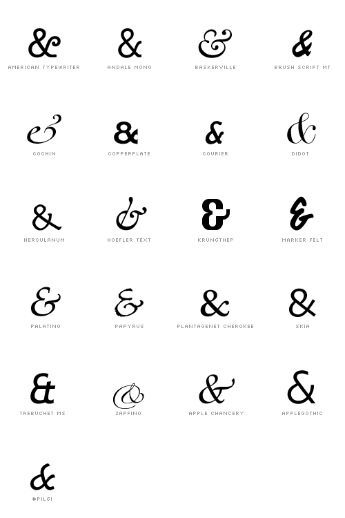
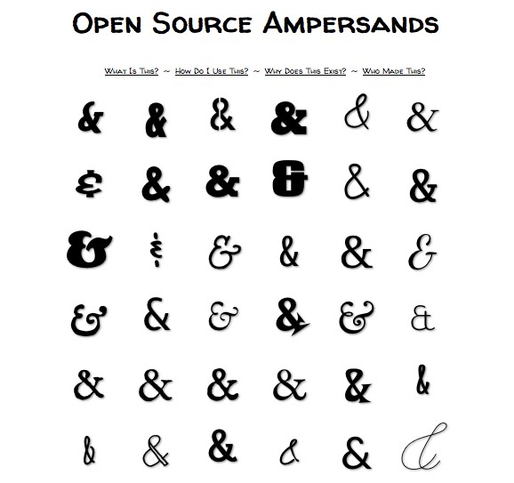
Did you know that the ampersand (&) was originally meant to be an e and t joined together. From the Latin et? Did you know that typographers love the &? Did you know you can judge a font by its &?
If you answered “no” to any of those questions then you need to get your & on. So. Check out these & resources.
You can, using a little bit of CSS, serve up fancy &s to visitors to your webpage. Here’s how (and it’s the source of these graphics).
Here are the &s available on Mac…
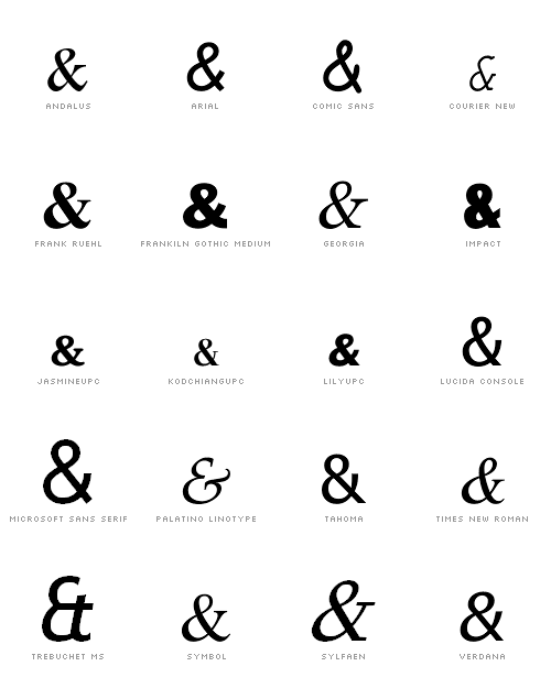
& on PC…
You can also, if you’re technologically inclined, install some webfonts. This site has a bunch. Here’s a sample.
I just finished reading what I think is possibly the best book you’ll read on Fonts and typography. You’ll laugh, you’ll cry, it’ll change your life… it changed the font here on St. Eutychus. I decided I was bored with Georgia and switched to Palatino. They look almost indistinguishable.
The book takes an entertaining walk down memory lane, stopping to study different fonts – as though they’re shopfronts – along the way. It makes the most of the Interweb’s collective fascination with typography – featuring the type of thing you’ve no doubt encountered here and elsewhere (including a vivid description of Max Kerning).
You’ll learn fun facts about Helvetica and Arial, the history of Futura, German blackletters, old school printing press movable type… how fonts are designed. You won’t regret it. Promise.

If you’ve ever been curious about the world of type but not known how to dip your toes in – or if you’re a bona fide expert who knows your baskerville from your goudy old style – then check it out. It’ll no doubt provide some good blogging fodder over the next few days before I return it to my dad. Who I borrowed it from.
I’m reading a book about fonts at the moment. A fairly long, and well written, entertaining book about fonts. It’s called Just My Type (Amazon). It pointed me to this video on YouTube:
And then mentioned that most fonts these days can be carefully examined using these two one word options:
Handgloves
or
Hamburgers.
Apparently all the rises, falls, and curves of the significant letters in a typeface can be tested in those two words. So there’s really no need for the fox after all.
Right. More font stuff to clear from my set of open tabs… Hopefully you’ll find these interesting or useful.
Here’s an “anatomy of a typeface” picture to examine so that when you read about fonts you know what’s going on.
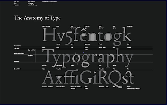
It’s from Font.is. You can get it in wallpaper size here.
I tend to stick with Helvetica as a user friendly sans serif for the web, and Georgia for serifed fonts (like on this site – at the moment). But if you want to stand out from the crowd (though arguably a Times derivative and Arial are the fonts of the masses). Then here are some alternative serifs, and sans serifs, for you to consider.
If the idea of matching fonts seems daunting to you – and it should… Because golden rule for graphic design and fonts #1 is don’t mix too many fonts… then you should check out Smashing Magazine’s guide to choosing fonts. It’s a five point list. One of the points is “know your types” – did you know fonts can be described in the following classes:

This little snippet on how to use fancy fonts (like the one in my header on St. Eutychus). The answer: sparingly.
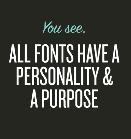
Periodically, there’s a need for a font that oozes with personality, whether that personality is warehouse party, Pad Thai or Santa Claus. And this need brings us into the vast wilderness of Display typefaces, which includes everything from Comic Sans to our candy-cane and bunny fonts. ‘Display’ is just another way of saying ‘do not exceed recommended dosage‘: applied sparingly to headlines, a display font can add a well-needed dash of flavor to a design, but it can quickly wear out its welcome if used too widely.
Good stuff. Keep it on file.
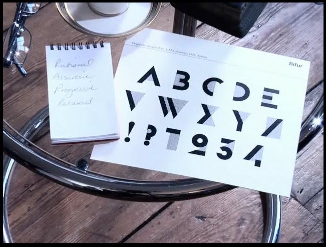
Then find out what font you are using this video quiz. Apparently I am Bifur.
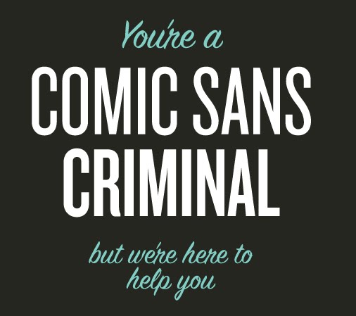
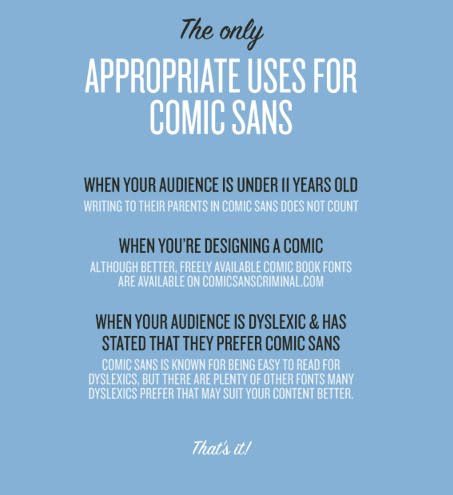
This is a nice bit of anti-Comic Sans propaganda – comicsanscriminal.com – that you should be aware of. Especially if you are a church. Please delete that font from your computers. There is no good reason to be using it in 2011.
Keep this in mind:
Although, apparently it is good for dyslexics.
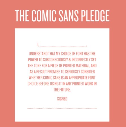
You can even sign this pledge at the end.
If fonts were people/super heroes.
From College Humo(u)r…
If Helvetica were a Mexican wrestler it would be called El Vetica. Or luchador (for those who know about these things).

Buy here.
After my typography post yesterday two funny things happened. My friend Amy sent me a link to Typography for Lawyers on Twitter, and Al, a former Lawyer, asked if there was anywhere he could learn more about typography. Look everyone. Synergy.
Check it out, you don’t have to be a lawyer to learn about typography from this website…

It’s full of handy advice.
Like this:
“Typography matters because it helps conserve the most valuable resource you have as a writer — reader attention.
Writing as if you have unlimited reader attention is presumptuous because readers are not doing you a personal favor. Reading your writing is not their hobby. It’s their job. And their job involves paying attention to lots of other writing.”“It’s the same on the printed page. The text matters, but if that’s all that mattered, then everything could be set in 12-point Times New Roman. And that would be the equivalent of staring at the lectern. In the same way that good speaking skills matter during an oral argument, good typography matters in a written document.”
“Good typography is measured on a utilitarian yard stick. Typography that is aesthetically pleasant, but that doesn’t reinforce the goals of the text, is a failure. Typography that rein forces the goals of the text, even if aesthetically unpleasant, is a success.”
And because it’s for lawyers he’s got a bunch of practical tips too.
Here’s his take on mixing fonts…