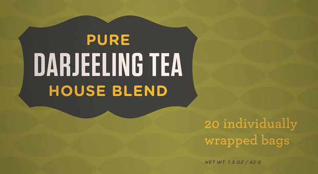
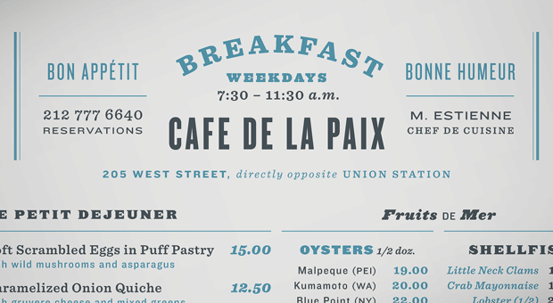
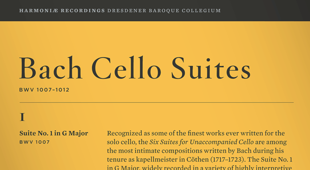
I like reading about typography. I’m pretty sure most of you don’t. But here’s a nice little guide to putting a bunch of fonts together on a design from fontsters Hoefler & Frere-Jones.


I won’t bore you with the all the details, but looking that good is expensive (those fonts combined cost over $400).
There are four principles in total. They’re expounded in the article.


Comments
I like that. At least I like how each of them look.
But I don’t understand what is going on. “similar proportions – different role”; “complementary moods”??
Can I read some more about this somewhere? I like it.