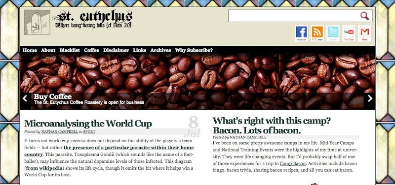
I have, unless you notice any major dramas dear reader, finished playing with my design.
It should look a little something like this:

If it doesn’t, could you let me know (and tell me what browser you’re using too…) Could you also let me know if you really hate it? Or like it. That would be great.
Comments
Looking good.
But this comment box is way wide (Firefox on a mac)
Hi Nathan,
I like it — I like the frame esp.
Two comments:
– the font and font colour don’t really match the frame (imo)
– I reckon there’s still too much on the page. My largely positive experience of your blog is somewhat tarnished by the inordinate time it takes to load, especially since I don’t read most of what it loads.
Dave
Oh…. Safari 5.0 on Mac OSX 10.6.4
Works fine on iPad mate. Can’t see any real issues.
The set up is nice.. not sure your palette matches the background image though. Try this: http://www.cssdrive.com/imagepalette/index.php
Looks ok, but i don’t really like the edges. looks girly, crafty…doesn’t suit your metro, cafe, hip 20-something vibe.
Wish I could say this looks great one my new Samsung Galaxy phone, but i don’t have one so I;; just say it works on Chrome.
I have 2.5 rows of the stained glass effect on the side
internet explorer
Aaran,
Try zooming in or out – the frame should take up more of the screen.
Gav,
Do you mean the stain glass? Since when is stain glass girly?
Andrew,
What sort of screen are you using, the fonts look ok on my high-res Mac (but I am colour blind)…
I call it as i see it Nath. Its girly stained glass. Try some blokey stained glass – go to Emmanuel College Chapel for inspiration maybe. ;-)
I don’t mind the idea of the stain glass border thing,but don’t think it’s really tying in with everything else that well..
It’s not the fonts, it’s that the colours of your main body don’t match the background, nor the the header picture of coffee or happy-clappers.. if you use that link, put your background picture in and it will come up with a matching palette of colours to use… though they’re likely to be blues and purples – how ‘girly’ that is could be debated.