The New York Times has an infographic today exploring the impact of the GFC on different age groups and demographics in America. It’s pretty fascinating. But it probably doesn’t directly translate to employment in Australia.
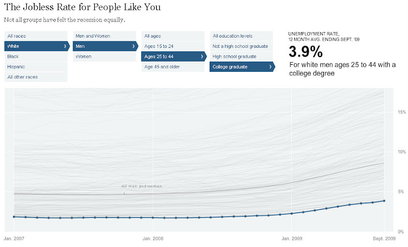
Men in America are sitting at an unemployment rate of 9.0% across all demographics, while women are at 7.3%.
College graduates fair remarkably better than non-college graduates, and people over 45 report much better employment rates than younger workers.
I assume this looks at people who want to be in work and aren’t though. Which is the traditional measure of unemployment – despite what some stupid government departments might suggest. Yeah, I’m looking straight at the ones who take the total workforce and subtract it from the total population…
If it did I’d be fairing well – as would people like me – with only 3.9% of white, 25 year old (and over) males with university degrees looking for work.