Tag: helvetica

The first rule of type club…
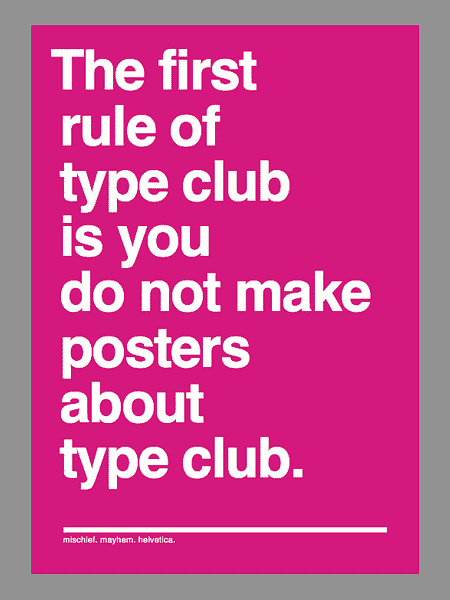
The first rule of Type Club is you do not make posters about Type Club.
The second rule of Type Club is you do NOT make posters about Type Club.
If someone says stop, goes limp, taps out, the critique is over.
Two typefaces at most in a composition.
One project at a time.
No Comic Sans, no Papyrus.
Sketching will go on as long as is has to.
If this is your first night at Type Club, you have to Type.
From I Like Type.
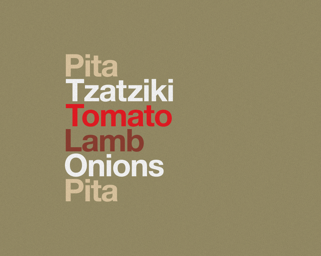
Mmm. Type Sandwiches
This brings some of my favourite subjects together – typography, Helvetica and burgers. Delicious mix.
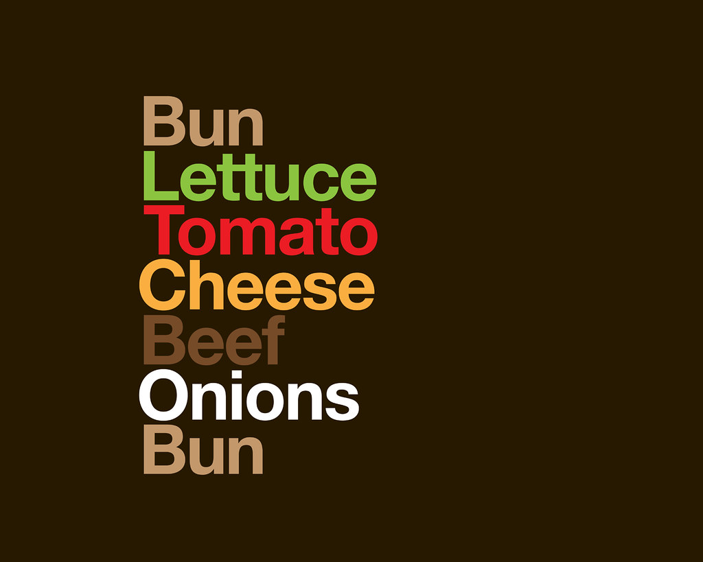
Via this Flickr set. There are more sandwiches there. But I love this one:

And this one:
Shirt of the Day: Font Face
If Helvetica were a Mexican wrestler it would be called El Vetica. Or luchador (for those who know about these things).
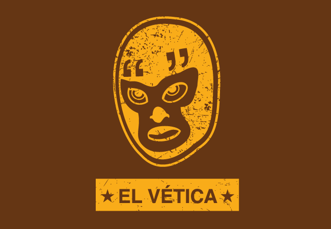
Buy here.
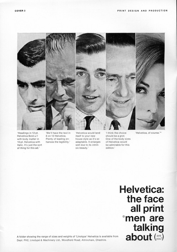
Font faces: An advert for a typeface
Helvetica is a nice font. Did you know that Arial is basically a plagiarised version of Helvetica? Perhaps not. But here’s an ad for Helvetica from Flickr.
Fontasic cookie cutter
Everybody’s favourite font (Helvetica) can now be everybody’s favourite cookie word. What would Cookie Monster say about that?


They’re from designer Beverly Hsu, who is researching mass producing them. They’ll probably use a lot of dough though.
If every logo looked the same…
I actually wouldn’t mind a world where every logo had to be produced using Helvetica. A vision put to the test here.


Shirt of the Day: Font irony
This one is guaranteed to confuse graphic designers. Like those posters that have the word “red” written in green writing. They don’t fool me. I’m colourblind.
But I’m not font blind.

Typecasting type
I’m not a font purist. I stick with the basics. Helvetica will do me… I like the idea of straying from the pack – but I’m no fontrepreneur.
It seems treading the line on fonts is more perilous than I thought… font purists are out there. Watching. Waiting for a slip up. Especially when it comes to the use of fonts in movies and television programs.
Choosing an inappropriate typeface is one problem. Applying one inaccurately is another. Sadly for type nuts, movies often offend on both counts. Take “Titanic,” in which the numbers on the dials of the ship’s pressure gauges use Helvetica, a font designed in 1957, some 45 years after the real “Titanic” sank. Helvetica was also miscast in “Good Night and Good Luck,” which takes place in the early 1950s. “I still find it bizarre to see type or lettering that is wrong by years in a period movie in which the architecture, furniture and costumes are impeccable, and where somebody would have been fired if they were not,” said Matthew Carter, the typography designer based in Cambridge, Massachusetts.
Just so you know…
Helvetica is a beautiful font. But if you’re going to use it in a heading it looks much nicer in bold.