Tag: infographics

Your weekly infographic: An array of Culinary tools

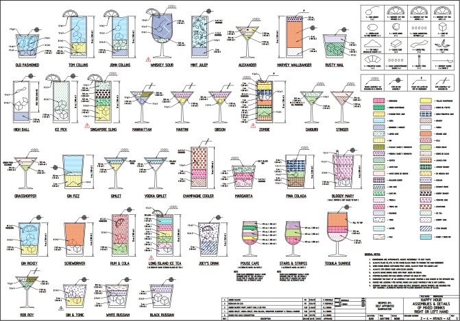
I like this (from Pop Chart Lab). Our kitchen has far too many of these, and yet, not enough.

It’ll cost you $20 as a poster.

“Here is a thorough mapping of over 100 tools used in the preparation of delicious food. Printed with real copper ink, the same substance you might find in a fine piece of cookware.”

Cocktail Schematics

My neighbour is an engineer. And when he had a cocktail night a couple of weeks ago he pulled out this Engineering schematic for popular cocktails (from here – where it is bigger).

That’s all well and good. But these Flickr visualisations exist for the rest of us (ie those who can’t read technical drawings).

Do you wear Band Name clothing?

Here’s an assessment of your personality on that basis. I have a Muse Shirt. I’ve liked them since 2002. So there. All you bandwagon jumpers and kiddies…

Wikipedia is ten, and a haven for atheists

Interestingly – half of all english language wikipedia editors have no religion. No wonder the Christian Right wanted to start their own (see Conservapedia) More interestingly, wikipedia founder Jimmy Wales (not to be confused with Jeremy Wales), thought that statistic was worth including in a ten year summary of the site.

And look. An infographic:

Via TechCrunch.

New Starbucks drink size is bigger than the human stomach

This is just crazy. Who needs this much over-roasted coffee anyway?

This is what it looks like for real.

This has been all over the interwebs. But I think I saw it first on ChurchCrunch. It’s originally from the National Post.

The Lifecycle of a T-Shirt

This is both funny, and true.

“I have a T-shirt problem: after years of buying them, my house is now full. Whilst recently trying to tidy up the situation I realised that I was subconsciously categorising them. As with everything on the internet, it ain’t a ‘thing’ until it’s visualised in an infographic. “

From Sleeping in My Head – where you’ll get a bigger version.

Disinformation Graphics

Infographics make the web go around. So it was only going to be a matter of time before people started putting together disinformation graphics. So, I give you, Helpful Figures.

Smalltalk Calendar

Just in case you’re a bit lost for words any month of the year (day of the week), just figure out where you are on this chart and go for it.

Via College Humour.

Web Workers Infographic

I like this. I found it via cafedave’s Google Buzz.

From here.

What’s in a domain name

Quite a bit of cash if you manage to secure one that is short, punchy, and in demand.

Here’s an article about the recent sale of the most expensive domain in that infographic.

Stereotyping Starbucks customers by the power of infographic

A Starbucks Barista apparently made this little chart profiling his customers and their orders:

I’ve got a more accurate profile for all of them:

Lacking in discernment and too eager to part with their money for low quality burnt coffee.

So there.

Via Yasrsly.

Mapping the Internet

This XKCD map of the internet is cool. Click it to make it bigger.

Facebook Demo-info-graphic

Is your mother on Facebook? Old people are signing up like never before…

Majoring on the miners

I would hate to be stuck underground not knowing that I was going to be in there for two months. That’s the fate of the miners in Chile. This infographic puts their plight into perspective.

Via The Daily What.

An infographic explaining infographics

I post lots of infographics. I like them. They are simplicity personified (though not as simple as a good Venn Diagram). But infographics are part of the search engine optimisation strategies of some of the web’s nefarious spammers.

So here’s an explanation.

Via Urlesque.