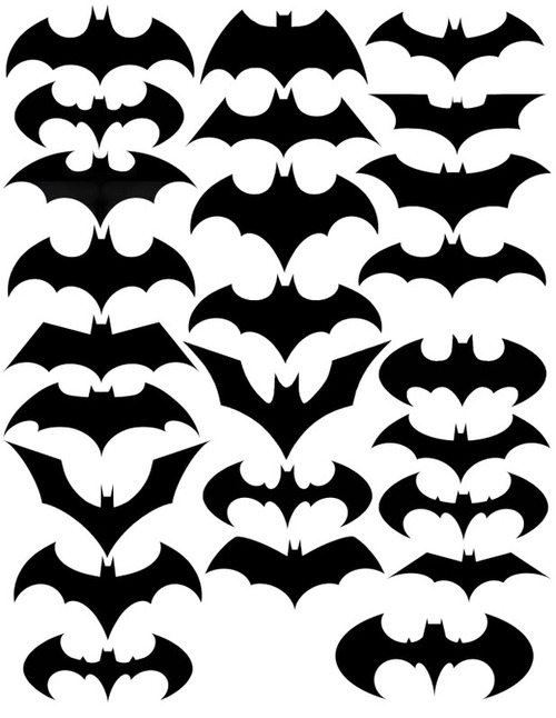
Staying edgy when you’re already out on the edge as the “caped crusader” is pretty tough. Here’s a chart of Batman’s attempts at “relevance” or “contextualisation.” Who says you shouldn’t change your logo with the times… (other than Superman).
Here’s a video identifying when and what versions led to the changes.
Via FlowingData.
Comments
Note how many of these are post 1980 when different Batman related comics/movies/tv shows began to proliferate.
The variations in logo design serving to differentiate the products while identifying them with the character.
Folks interested in design might find these studies by Todd Klein of interest. Klein examines the development of the logo of just the main Batman comic book over five posts.
Batman comic logo 1
Batman comic logo 2
Batman comic logo 3
http://kleinletters.com/Blog/?p=267
Batman comic logo 4
Batman comic logo 5