Tag: fonts

How to make a font palette

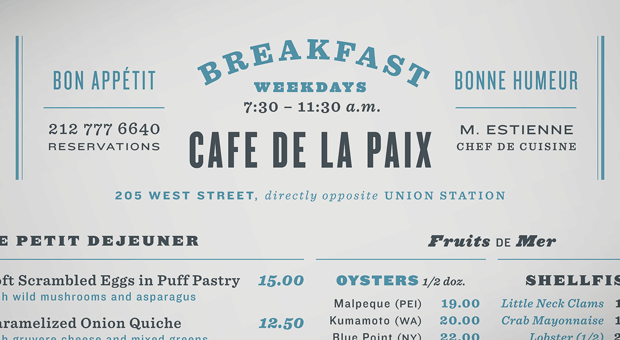
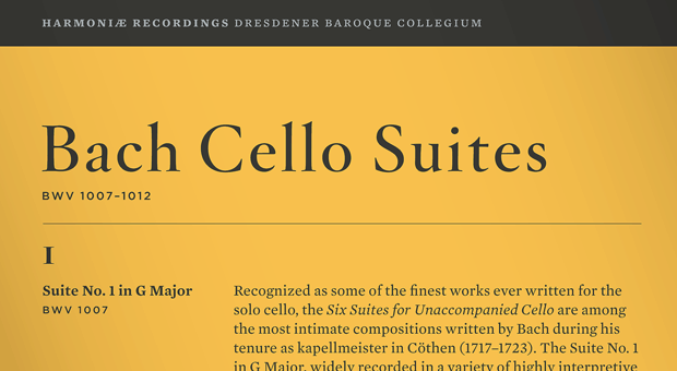
I like reading about typography. I’m pretty sure most of you don’t. But here’s a nice little guide to putting a bunch of fonts together on a design from fontsters Hoefler & Frere-Jones.


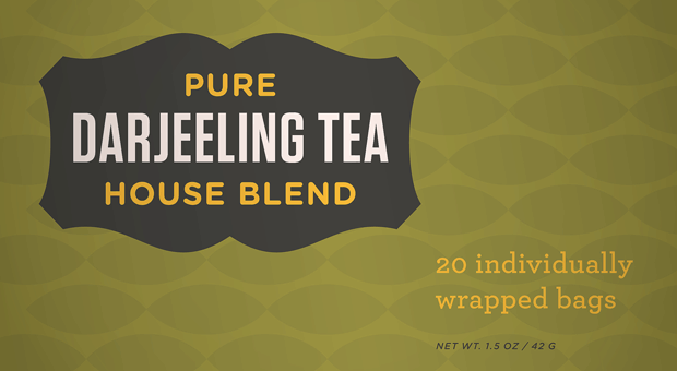
I won’t bore you with the all the details, but looking that good is expensive (those fonts combined cost over $400).

There are four principles in total. They’re expounded in the article.

Font faces: An advert for a typeface

Helvetica is a nice font. Did you know that Arial is basically a plagiarised version of Helvetica? Perhaps not. But here’s an ad for Helvetica from Flickr.

Comic Sans fights back in an expletive laced tirade

Comic Sans, the world’s most maligned typeface, has come out swinging via this imagined monologue from McSweeny’s Mike Lacher. A sample (the language is a little blue).

“You don’t like that your coworker used me on that note about stealing her yogurt from the break room fridge? You don’t like that I’m all over your sister-in-law’s blog? You don’t like that I’m on the sign for that new Thai place? You think I’m pedestrian and tacky? Guess the **** what, Picasso. We don’t all have seventy-three weights of stick-up-my-ass Helvetica sitting on our seventeen-inch MacBook Pros. Sorry the entire world can’t all be done in stark Eurotrash Swiss type. Sorry some people like to have fun. Sorry I’m standing in the way of your minimalist Bauhaus-esque fascist snoozefest. Maybe sometime you should take off your black turtleneck, stop compulsively adjusting your Tumblr theme, and lighten the **** up for once.

People love me. Why? Because I’m fun. I’m the life of the party. I bring levity to any situation. Need to soften the blow of a harsh message about restroom etiquette? SLAM. There I am. Need to spice up the directions to your graduation party? WHAM. There again. Need to convey your fun-loving, approachable nature on your business’ website? SMACK. Like daffodils in m********* spring.”

Anatomy of a typeface

Have you ever had a burning desire to understand typography better but not been sure where to start – this A to Z of font design has you sorted. It has pictures, and links to handy articles from Typedia.

Aperture: Opening at the end of an open counter.

Aperture

Arm: A horizontal stroke not connected on one or both ends.
Arm

Ascender: An upward vertical stroke found on lowercase letters that extends above the typeface’s x-height.

Ascender

The perils of bluetooth and font snobbery

From XKCD.

Cemetery

Font of font knowledge

A font flow chart for every occasion – though it doesn’t include Helvetica. Sadface. Click to make bigger.

Via Lifehacker.

Update – as Gav points out, Helvetica is there. I just missed it.

Dynamic fonts are clever

I have seen the future of typography and its name is Liza Pro.

I’m sure there are other fonts that do this out there, but Liza has a character database of 4,000 letters – it will, in the right design software, change which version of a letter it uses based entirely on context.

“Liza Display Pro rocks the script lettering to the max. The build-in Out-of-ink feature, LetterSwapper and Protoshaper makes this font a realtime-digital-calligrapher. She’ll swash up your text drastically, giving long strokes, loops and swashes to letters if their context allows”

Clever. But expensive.

True type fans

I’m as big on good fonts and typography as the next guy. Just not as big on a particular font as these next guys…

Font in pens

That title was meant to be a pun based on “fountain pens” it probably fails because I feel the need to introduce the rather amazing concept behind this post with a non-sequitur. I could try to redeem this lede with some sort of segue – but perhaps I should just get to the point (pun intended).

A couple of designers have conducted an elaborate plot to measure the ink use of popular fonts. They did it by writing the word “Sample” on a wall with ball point pens and then photographing the pens once it was done.


It turns out Garamond is the best – but I’m not sure they considered ecofont.

Shirt of the Day: Font irony

This one is guaranteed to confuse graphic designers. Like those posters that have the word “red” written in green writing. They don’t fool me. I’m colourblind.

But I’m not font blind.

Lots of ands

Can you put the word and in a sentence five times in a row?

I can. The signwriter said there had to be more space between pig and and, and and and whistle. If you like your ands as ampersands – pig & & & & & whistle – then you should check out this tumblog of 300&65 ampersands. Each one in a different typeface. They say you can judge a typeface by its ampersand.

ITC Garamond, Ultra Italic

Typekit try out

I’m using this blog as a bit of a typography sandbox today because we’re doing a long awaited redesign to our work websites.

I’m currently trialling TypeKit – a webapp that lets you dynamically use non-standard fonts.

Here are three handy articles I’ve read today.

Typecasting type

I’m not a font purist. I stick with the basics. Helvetica will do me… I like the idea of straying from the pack – but I’m no fontrepreneur.

It seems treading the line on fonts is more perilous than I thought… font purists are out there. Watching. Waiting for a slip up. Especially when it comes to the use of fonts in movies and television programs.

Choosing an inappropriate typeface is one problem. Applying one inaccurately is another. Sadly for type nuts, movies often offend on both counts. Take “Titanic,” in which the numbers on the dials of the ship’s pressure gauges use Helvetica, a font designed in 1957, some 45 years after the real “Titanic” sank. Helvetica was also miscast in “Good Night and Good Luck,” which takes place in the early 1950s. “I still find it bizarre to see type or lettering that is wrong by years in a period movie in which the architecture, furniture and costumes are impeccable, and where somebody would have been fired if they were not,” said Matthew Carter, the typography designer based in Cambridge, Massachusetts.

Font flow chart

By now you know that Comic Sans is terrible. If you’re still struggling and want a helpful flow chart – I’ve found one for you

Whey cool game

Test your knowledge of fromage and fontage with this Cheese or Font game.

Who names these things?