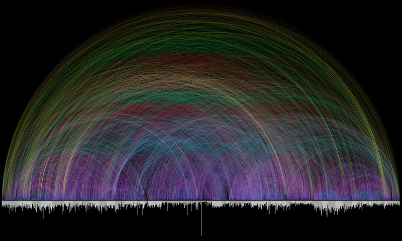
Someone on a comment thread discussing the “Contradictions” visualisation I posted yesterday pointed out that it’s remarkably similar to this visualisation of cross references I posted ages ago from Chris Harrison. Lets have a look at them together… I had remembered this cross reference one at the time, and thought it interesting that they took the same approach to presenting the graphic. But given both have presented their data sources, I’m not suggesting plagiarism (the atheist one acknowledges the influence of the other one). There are 63,000 odd cross references in the colourful one, and only 419 contradictions in the red one… but the shapes are very similar. Aren’t they.

It is interesting though, that one speaks to the internal consistency of the Bible while the other presents apparent discrepancies. Could it be that Sam Harris and his designer have a better take on the nature of interactions between texts in the Bible? I doubt it.
Comments
I was looking at the print purchase of Chris Harrison’s graphic, and it turns out that National Geographic News noted it among the best science images of 2008 — fair enough!
Have you seen some of his other infographics? Amazing stuff.
[…] — contradictions which are usually just poor reading/interpreting of the text — the number of contradictions is hugely overwhelmed by the number of corroboratio…). So here’s what I’m picturing in my head. It’s a piece of performance art. Of sorts. […]