Right. More font stuff to clear from my set of open tabs… Hopefully you’ll find these interesting or useful.
Here’s an “anatomy of a typeface” picture to examine so that when you read about fonts you know what’s going on.
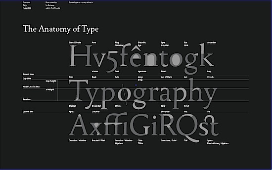
It’s from Font.is. You can get it in wallpaper size here.
I tend to stick with Helvetica as a user friendly sans serif for the web, and Georgia for serifed fonts (like on this site – at the moment). But if you want to stand out from the crowd (though arguably a Times derivative and Arial are the fonts of the masses). Then here are some alternative serifs, and sans serifs, for you to consider.
If the idea of matching fonts seems daunting to you – and it should… Because golden rule for graphic design and fonts #1 is don’t mix too many fonts… then you should check out Smashing Magazine’s guide to choosing fonts. It’s a five point list. One of the points is “know your types” – did you know fonts can be described in the following classes:

This little snippet on how to use fancy fonts (like the one in my header on St. Eutychus). The answer: sparingly.
Periodically, there’s a need for a font that oozes with personality, whether that personality is warehouse party, Pad Thai or Santa Claus. And this need brings us into the vast wilderness of Display typefaces, which includes everything from Comic Sans to our candy-cane and bunny fonts. ‘Display’ is just another way of saying ‘do not exceed recommended dosage‘: applied sparingly to headlines, a display font can add a well-needed dash of flavor to a design, but it can quickly wear out its welcome if used too widely.
Good stuff. Keep it on file.
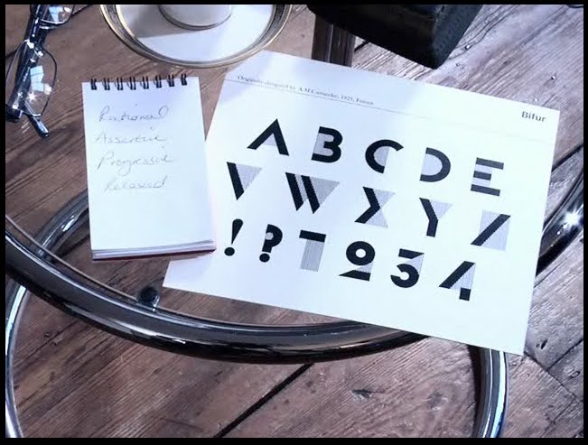
Then find out what font you are using this video quiz. Apparently I am Bifur.