The internet is now saturated with infographics and visualisations. I’ve done my fair share of propagating this. So, at what point does this become meaningless clutter, rather than clarity cutting through the communication noise of the world wide web.
Who knows, but I’m starting to enjoy humourous visualisations more than the real thing… and so is the New Yorker.
You could do worse than perusing some of the efforts of this guy named Ben Greenman.

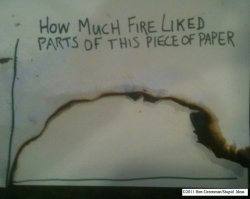
This one is actually interesting, though largely pointless.
Comments
Thanks for the inspiration!
Geeky moment.
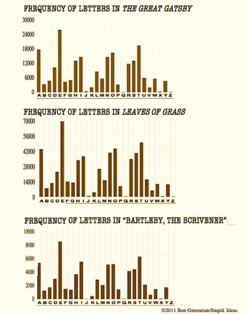
Those last bits of data aren’t pointless. I did an assignment back at Uni where we needed to decrypt a coded message based on the frequency of letters in regular english communication.
So I reckon with those three graphs you could probably hack ASIO – or at least solve some puzzles at the back of the newspaper.