In my post on church websites the other day I mentioned that principles of page layout, and information architecture, from newspapers were still a good yardstick for web design. And there’s good data for this – because it’s possible to track how people read, or experience, websites using eye tracking.
The basic rule of thumb is that people pay the most attention to the top left of your page, and stay hooked as long as your content is good, and so long as they’re finding what they expect to find, where they expect to find it.
Eye tracking is a pretty cool, and reliable, measure of how people experience your website – and a good way to figure out if it’s doing what it should do, and if people are noticing what you want them to notice. Here’s a nice journal article from a Web Usability Journal that explains it. Here’s an article that provides a slightly more balanced view on its value than you’ll find from people spruiking its merits.
Eye tracking and Text
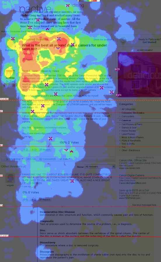
This is like a Bureau of Meteorology weather map – red and yellow represent places where people’s eyes lingered longest.

Image Credit: Yahoo Eye Tracking article
“Yahoo! eye-tracking studies reveal a general pattern to the way people browse webpages:
People scan the main sections of a page to determine what it’s about and whether they want to stay longer.
They make decisions about the page in as little as three seconds.
If they decide to stay, they pay the most attention to the content in the top part of the screen.
When people do decide to read a page, their eyes sweep horizontally from left to right, often focusing on a roughly triangular area in the upper-left corner of a webpage, or the upper-left corner of the webpage’s main block of content. But this pattern varies depending on a page’s layout and purpose. For example, a person’s eyes will move differently over a photo-heavy slideshow, a text-heavy blog, or a page with a two- or three-column layout.”
Jakob Nielsen is a web usability guru. His company put together a book on eyetracking, and found, like the Yahoo thing above suggests, that users tend to focus on the top half of a page to figure out if they’re going to stick with you – if you’re putting the important stuff at the bottom, you’re missing out.
This is true for pretty text heavy pages too – but why you’d have a text heavy page that isn’t a blog these days is beyond me…
They say readers tend to follow an F shaped pattern, something like this:
They also found that people love information in bulleted lists.
Interestingly, on the scroll/above the fold front – people will scroll if you grab them with the stuff you feature “above the fold”…
“The most basic rule of thumb is that for every site the user should be able to understand what your site is about by the information presented to them above the fold. If they have to scroll to even discover what the site is, its success is unlikely.”
Here’s another study on scrolling and “the fold.”
Eye Tracking and pictures
One of the interesting things Nielsen’s research found is that images can make or break a page – depending on how relevant they appear to the site’s content – so how much they relate to what people are looking for… Their research says:
- Some types of pictures are completely ignored. This is typically the case for big feel-good images that are purely decorative.
- Other types of pictures are treated as important content and scrutinized. Photos of products and real people (as opposed to stock photos of models) often fall into this category.
Here’s the application of the eye-tracking stuff to the first point…
users ignore stock photos of “generic people”:
Nielsen suggests images work best when they carry information and aren’t generic (these guys say the same thing).
This is why I like the concept of an image slider featuring pictures that include descriptive captions/text within the image and clearly contribute something for your audience.
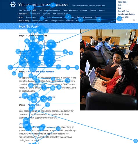
Another cool thing, this time from a Smashing Magazine list of usability facts, is the finding that people like pictures of people’s faces.

And, perhaps even cooler – we are guided by where people are looking…

There’s a study that demonstrates this…
Eye Tracking and videos
I mentioned that we’re going to be putting a bit of effort into videos as part of the story based nature of our content, it’s worth having a read of this Nielsen post about how boring talking head videos are.
In this case, the blue bits that are overlapping the red stuff indicate the places people aren’t watching… the guy’s face draws the eye for a while, but the viewer’s attention wanders pretty quick smart. This is from a 24 second clip of a four minute video.

While some people are paying attention to what the face is doing, a lot of people are trying to figure out how to get away from that head as quickly as possible, checking out the other links and the video controls. There’s a nice little video of how the eye tracking software worked in this instance (or rather, where the viewers were looking) at the Nielsen article.
Nielsen has these useful tips for video:
“… the main guideline for producing website video is to keep it short. Typically, Web videos should be less than a minute long.
A related guideline is to avoid using video if the content doesn’t take advantage of the medium’s dynamic nature. This doesn’t mean incessant use of pans, zooms, and fades to add artificial movement. It does mean that it’s better to use video for things that move or otherwise work better on film than they would as a combination of photos and text.
Finally, recognize that Web users are easily distracted, and keep distracting elements out of the frame of your shots. If there’s a road sign in the video, for example, users will try to read it and will thus miss some of the main content.”


Comments
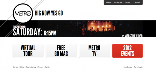
Metro Church’s slogan is seriously “Big Now Yes Go” ?!! Were those the 4 words that got the best results in church-shopper focus groups? Sheesh.
Their home page certainly avoids visual clutter, although the site nav at the top right reveals the usual long list of topics under the church-ese “ministries” heading. They are also guitly of my number one gripe for church websites: I came to the homepage, and was shown a bunch of fancy buttons and photos, but nobody spoke to me via a warmly-worded sentence. Imagine if that were the case when I turned up on a Sunday.
I find Nielsen’s points about the appropriateness of video very persuasive. Personally I hate being forced to get info via a video that I could have got by reading. If I’m at work it means I need to plug in headphones and give my full attention to the video for X minutes rather than dipping into it when I have a spare moment. When I’m on the train it means I have to decide it’s worth the extra data usage, wait extra time for it to load, and face the definite possibility that I won’t have enough bandwidth to view it anyway. Text and well-chosen images put the user in control. But then I’m generation X so I’m probably 10 years out of date…
Hi Tom,
I agree – I’m certainly not looking to emulate the content of Metro’s website – just the style (except the drop down menus).
I also agree on the video front – we won’t be putting up any videos that don’t have a full transcript as an alternative option. Videos, the content at least, doesn’t register with search engines, so offers nothing of value in terms of bringing people to your page… the Metro virtual tour, though, is incredibly useful, especially as it both points people to things on the page, and gives a really good feel for what being at church will be…
Sounds good. It sounds like you guys are well resourced in the media area – looking forward to seeing what you build.
(I know Metro church weren’t the focus of the article – I just couldn’t help exclaiming!)