I thought this piece of Graphjammy goodness was too good to pass up after last week’s music debate.
I put U2 on the right hand side.

I thought this piece of Graphjammy goodness was too good to pass up after last week’s music debate.
I put U2 on the right hand side.
This article pretty much sums up why I don’t like U2 (and Coldplay for that matter).
U2 have long been so ubiquitous that their music has threatened to lose all meaning – for me, it happened around 1988 – but of late, they have truly excelled themselves. Some questions: when Bono is photographed going to church in New York with Blair, what does that do the idea of rock as The Other? Is their slide heartening proof that, after years of handwringing about music becoming so pan-generational and pro-establishment it had lost all meaning, there may actually be a point where the great unwashed realise a group stands for absolutely nothing, and recoil? If so, watch out Coldplay.
Are you a U2 fan? Are you offended by such snobbery?
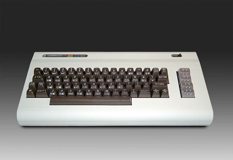
Video games these days are so much more fun than they were when I first picked up a console controller. I can’t remember which came first – the NES or the CD TV – it’s all a bit of a blur. Having a father with a casual gig writing games reviews had its perks. Actually, it must have been a NES. Unless the Vic-20 counts as a console…

It did, from memory, plug into your TV… in fact, as a delightful tangent – I should point out that Dad’s game reviewing gig came after he wrote and published this book – unavailable for GBP4.95 from The Book Depository – for those of you who aren’t link clickers it was called “Beyond Simple Basic – Delving deeper into your Vic-20”. Seriously, with a father like that what chance did I have of not turning out as a geek.
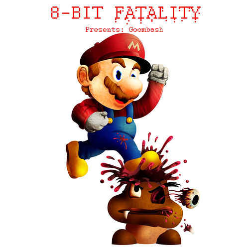
Anyway, that’s a significant digression from my original point – but the Vic-20 was an 8-bit machine, so it’s tangentially related. My point was – games are now better. And I’m going to suggest that graphic violence is what makes that so. So it warms me to the cockles of my heart to see this Flickr set – of 8-bit characters rendered beautifully and experiencing graphic deaths. Here’s the demise of a Goomba – cleverly titled Goombash…

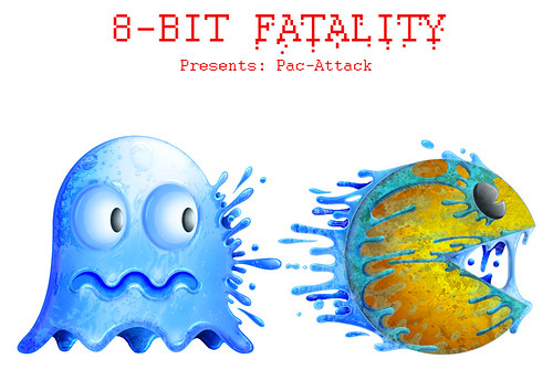
There are plenty more where that came from. Including this Pac-Attack…

* the title is only vaguely clever if you know that there are 8 bits to a byte. I have actually always wondered why 8-bit machines weren’t called one byte machines. I might have to look that up…
The old saying holds true, you can judge a book by its cover, especially a self-help book. When it comes to designing the cover for a self-help book it’s helpful to throw any artistic taste out the window. Bright colours and lots of lines at different angles are important when it comes to making your book stand out on the shelves of the bookshop. You don’t want your book to be buried in a sea of boring book covers, you want it to stand out like a pink neon sign in a black and white movie. Self-help book covers are one place where sticking out like a sore thumb or being a sunflower in a field of lavender is a good thing. It’s also important that your name feature prominently on the front cover.
The back cover of a self-help book is just as important. Readers of self-help books like to check who has been helped by either the book or its author in the past. It’s a good idea to have some positive quotes from well-known people or something quotable from a review your book received in the press. This doesn’t have to be the real press as it’s almost unverifiable. You could just send a letter to the editor of a really small newspaper that publishes everything and use your own quote, but only do this if you get really desperate.

An artist’s impression of the ideal book cover…
Stephen Colbert is a most fantastic interviewer – if you want the interviewee to feel particularly awkward. On Thursday he took on Bert Ehrman – who is pushing a new book about contradictions in the bible…
Colbert, a practicing Catholic, rips him apart. A bit. It’s interesting viewing.