Tag: cool design

News headlines posterised

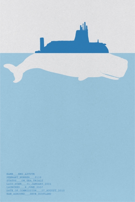
This is cool. Some guy named Johnny Selman is turning news headlines into posters hoping to encourage more people to follow the comings and goings on the global stage.

Some samples:

“ANARCHISTS BLAMED FOR ROME EMBASSY BOMB ATTACKS”

“NUCLEAR SUBMARINE HMS ASTUTE RUNS AGROUND OFF SKYE”

Moses: The Waterbender

I didn’t see that movie about the kid who could play with air. Who needs that stuff when you’ve got the Bible.

Check out Moses. From Zero-Lives’ Flickr.

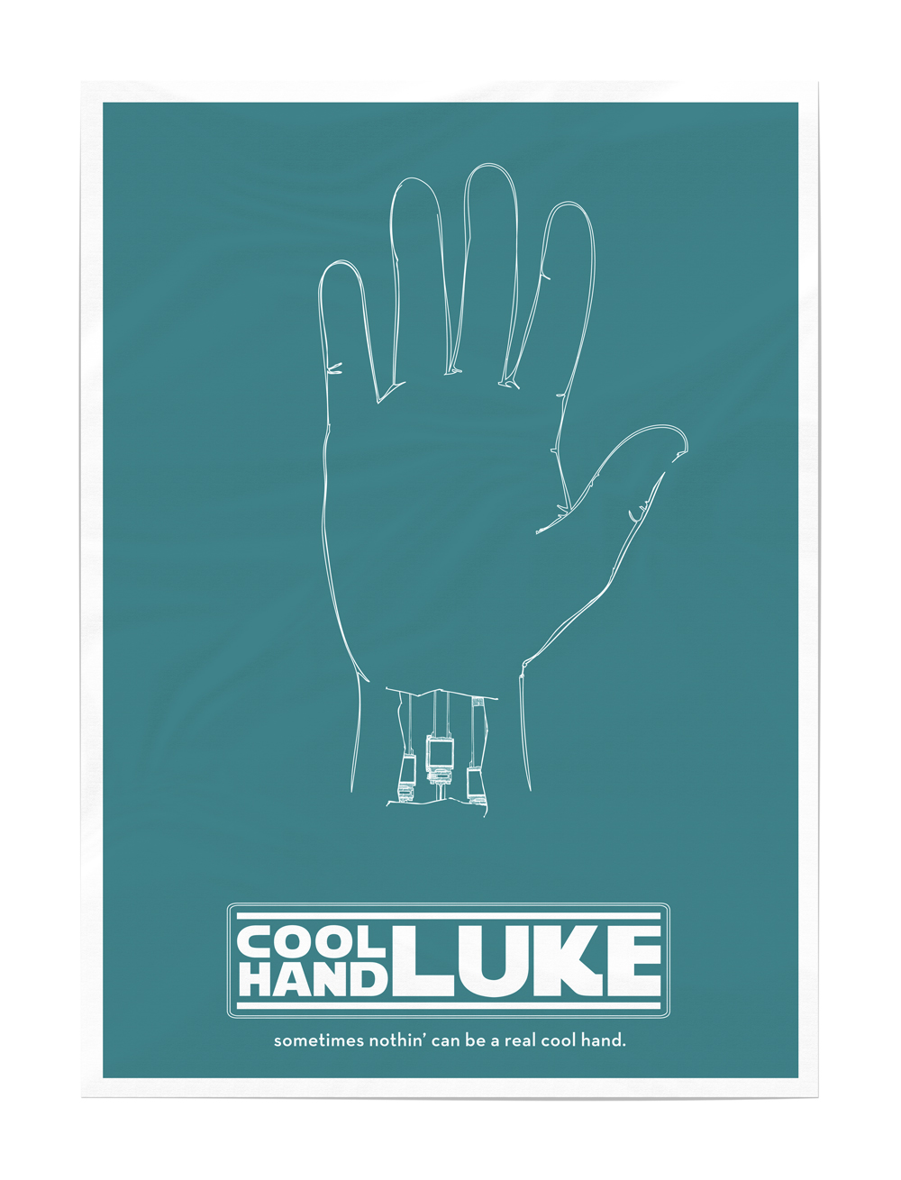
Movie Posters: With a touch of Star Wars

These classic movie posters reinterpreted through the lens of Star Wars are pretty cool.

More here.

The phat controller

Here’s a novel solution to losing the TV remote between the couch cushions… turn the couch cushion into a remote. Brilliant.

Passing the remote to one another across the room might become a slightly more violent affair though…

From here (they’re actually for sale… for $30. Just in time for Christmas).

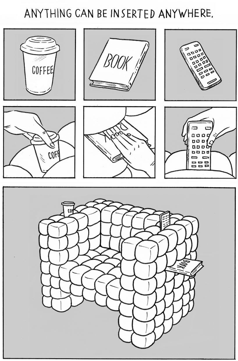
Alternatively. You could get one of these sofas that is designed to have things stuck in it…

Via Design Bloom.

Ride a bike horse to Bandbury Cross

I don’t know where Bandbury Cross is, but you’ll be a fine lady (or gentleman) upon a white horse if you deck out your bike with this gear:

From Design Bloom, designed as part of a Seoul Cycle Design competition.

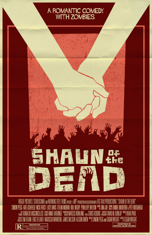
New movies, Old posters

These are fantastic.

More here.

Mo money, mo problems

Are you Movembering? I would if I could. But I can’t. My mo don’t grow. This year I even tried growing it a month in advance.

And that’s the results…

Which is a shame. Because Movember is awesome. This is what internet activism and awareness raising should look like. Not some stupid innuendo based “secret” campaign.

So, instead of calling for people to donate to my Movember efforts – I’m encouraging you to donate to my friend Paul’s efforts. Plus, he has a ranga mo – so he needs all the support he can get…

I love the marketing campaigns and stuff springing up around Movember.

And especially these pictures, which were what mo-tivated me to write this post to begin with.

Moustaches make a difference…

These, and more, via Scary Ideas.

Teenage Mutant Ninja Panelvan

If you are sick of your boring van why not follow this girl’s lead and turn something boring like this:

Into something exciting like this:

From Jalopnik.

Sideways Cafe

I love cafes. In my ideal world I would spend most of my time in one. That’s what I think full time ministry is going to look like (based mainly on Al and Mikey’s blogs).

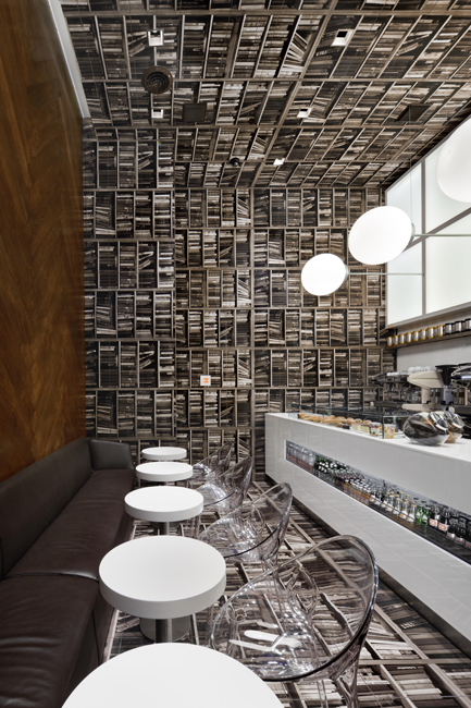
This cafe is amazing. It’s been designed to look like a library flipped on its side. Cafes and libraries. That’s what I reckon heaven’s main shopping street will consist of.

“The “books” are actually tiles printed with sepia-toned photos of bookshelves at a local travel bookstore that ring the room, including the floor, walls and ceiling. In addition to painting unusual surfaces with intriguing patterns — whoa, you’re standing on books! — it gives an Alice in Wonderland-esque sense that the room has been suddenly upended.”

More info about the cafe here.

The Burger Experts

This is a fantastic ad.

But you know who are the burger experts. Fergburger, Queenstown, New Zealand.

Since my year of no fast food ended on the first of July I have had the chance to try several of the Grand/Mighty Angus burgers, and I’ve got to say, they are pretty fantastic.

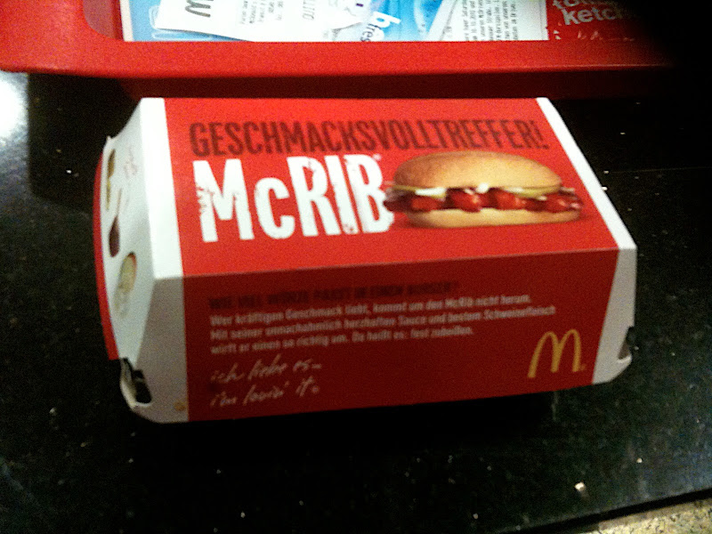
But not as good as the McRib. Which I tried in Singapore. The McRib is a menu enigma. There’s even a web page devoted to its appearance around the globe.

Ikea recipe book brings Allen key to the kitchen

Good news for those looking to completely assemble their lives IKEA style. Everybody’s favourite Swedish retailer has produced a cookbook. Here are some of the photos of the ingredients for dishes therein.

Musical table

Want a piano but don’t know where to fit it? Hide it in your dining table.

Via likecool, designed by Georg Bohle.

It makes your dining table singalongs a whole lot more classy.

Colourblind Clock the perfect excuse for tardiness

I’m slightly colourblind. It doesn’t trouble me all that much, because it’s pretty rare that one is confronted with one of those dot tests with obscured numbers.

But this clock, which takes the form of said dot tests, gives me the perfect excuse to be late for everything… the same way I have the perfect excuse to run red lights (ie. by the age of 26 I should know where the correct lights and numbers sit on the traffic lights or clock).

It’s worth just 35 pounds. A small price to pay.

Ampersand food: for foods made to go together

We all know that some foods were made to go together. Perhaps the most appropriate way to recognise this is in ampersand form. Like these:

There are more here from designer Dan Beckemeyer. Via The Jailbreak.

Designing the Word

This is incredible. A graphic designer, looking to come to grips with the big idea of books of the Bible is trying to put together a design based on each book. I’m sure it’ll be useful for your contempervant Bible Study books… These are some of my favourites.