If you looked through wikipedia articles on major world events, and plotted them on a map, and then removed the map, you’d get a video looking something like this:
A History of the World in 100 Seconds from Gareth Lloyd on Vimeo.
If you looked through wikipedia articles on major world events, and plotted them on a map, and then removed the map, you’d get a video looking something like this:
A History of the World in 100 Seconds from Gareth Lloyd on Vimeo.
Alexander Chen is working on a project turning those train route maps you see all around the world into a musical instrument.
Watch the demo:
Conductor (Interactive instrument in progress) from Alexander Chen on Vimeo.
He has set them up so that the train schedules, and intersections determine the order the notes are played in, and how frequently, which is a pretty nifty piece of data visualisation, or perhaps actualisation, or auralisation…
From both the US and UK. This is a nice little visualisation using one of my most favourite games in the world to put some financial figures into perspective.
This is a nice little visualisation of Facebook connections around the planet. All the lines on the map are created by connections between people (the brighter the line the more friendships exist along that axis.).

A guy named David McCandless put together some data visualisations for a talk he gave at TED. You can watch it here.
But in my opinion, his really interesting research went into this graph of when people experience relationship break downs based on mentions of “break up” or “broke up” in Facebook status updates.
Here’s the graph (posted on Information is Beautiful):

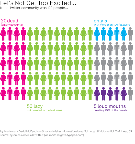
He also put together this cool “if Twitter was 100 people” visualisation that I’ve posted before (I think)…
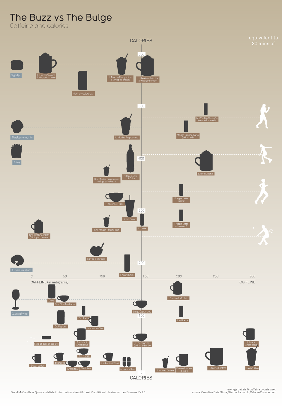
And this one on caffeine and calories, that I know I have posted before.
Data visualisation is the future of communication – Christians need to think about how we can use it well to communicate the truths of the gospel.