A guy named David McCandless put together some data visualisations for a talk he gave at TED. You can watch it here.
But in my opinion, his really interesting research went into this graph of when people experience relationship break downs based on mentions of “break up” or “broke up” in Facebook status updates.
Here’s the graph (posted on Information is Beautiful):

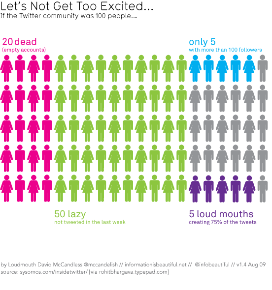
He also put together this cool “if Twitter was 100 people” visualisation that I’ve posted before (I think)…
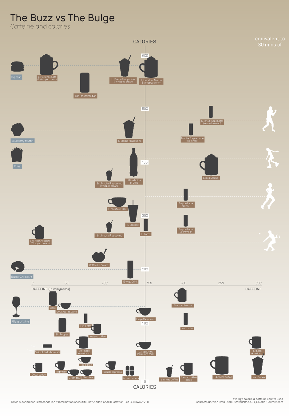
And this one on caffeine and calories, that I know I have posted before.
Data visualisation is the future of communication – Christians need to think about how we can use it well to communicate the truths of the gospel.
Comments
I wonder if McCandless’ word analysis recognises the fact that “break up” statuses around the end of the year may be referring to break up events such as end of school year or pre-Christmas company parties.
Yeah, you’d think changes in relationship status from “in a relationship” to “single” would be a better measure.
Nice observation, Martin.
Did some not too difficult digging (it’s in the footer of the image, don’t know why I didn’t see it before) and it turns out the phrase they searched for was “we broke up because”… so that probably rules out that sort of Christmas break up…
*nods*
He does deal with data by trade…