Tag: graphic design

A (lengthy) primer on Graphic Design

This transcript of a radio piece provides a nice little snapshot of the inner workings of a graphic designer’s mind, when it comes to how they think about their own profession.

Some quotes.

“Graphic design has been likened to a wine glass. When we drink wine we barely notice the glass it’s served in. It wouldn’t be true to say that we don’t care what glass we drink out of — we wouldn’t choose to drink a rare vintage out of a Tupperware mug, for example — but it’s the wine that matters, not the vessel it comes in.”

“For many observers and commentators, graphic design’s embeddedness in commercial culture makes it into one of the specious modern black arts, like spin, hype and branding. And it’s undoubtedly true that most graphic design is about selling things in a consumer society.”

“Most recognise the fundamental difference between artists and designers: artists create work that comes from an inner impulse. Or to put it another way, they write their own briefs. Graphic designers, on the other hand, respond to briefs supplied by others — they are reactive. To go back to our glass of wine — artists supply the wine, graphic designers supply the glass.”

I, for one, appreciate the work of graphic designers. They make it possible to judge an object by its appearance because their work ties an object to a particular culture. And I like that.

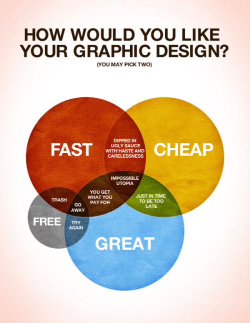
The Graphic Design Conundrum as a Venn Diagram

This is pretty true for just about every purchasing decision.

Via Tumblr somewhere.

Powerpoint horror stories: some of the world’s worst slides

Urgh. There’s no greater design faux pas than an overloaded powerpoint. Especially an overloaded powerpoint with wordart.

Do your powerpoint slides look like this? I hope not. I tell everybody that the people who read my blog have class and intelligence. Not to mention taste. So lets all laugh at these people together. It’s the only way they’ll learn.

Infocus ran this competition to find the world’s worst slides, and provided these tips for not finding yourself on that list.

Typographic Sins

It has been a while since my last typography related post. So here, as my penance, is a list of typographic sins, with examples (in a PDF) for you to mull over. It’s pretty standard fare. But they are good rules for keeping in mind in order to satisfy your pedantic/designer friends…

  1. Two spaces between sentences.
    Repent of this sin by using only one space.
  2. Dumb quotes instead of smart quotes.
    Evil: “Thou shalt not misuse type” § Good: “Thou shalt not misuse type”
  3. Dumb apostrohe instead of a smart apostrophe.
    Profane: Don’t use prime marks § Sacred: Don’t use prime marks
    By the way, apostrophes always face this way: Pot o’ gold.
    They never face this way: Pot ‘o gold.
  4. Failing to tuck periods/commas inside quote marks.
    Immoral: “I love type so much”, she confessed.
    Chaste: “I love type so much,” she testified.

Font of font knowledge

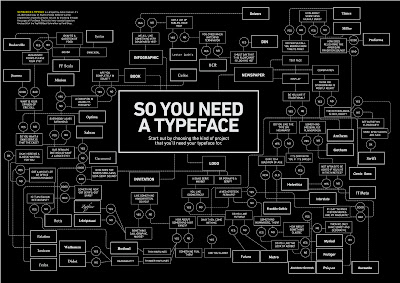
A font flow chart for every occasion – though it doesn’t include Helvetica. Sadface. Click to make bigger.

Via Lifehacker.

Update – as Gav points out, Helvetica is there. I just missed it.

Thorney hijinks

These David Thorne specials made me laugh. He’s the spider drawing guy…

In this one he takes on a school chaplain (Thorne is an atheist) who sent out a parental permission form for a dramatic Easter presentation from the local uniting church with the “yes” box already ticked. Thorne recounts his own experience in a church play.

I was actually in a Bible based play once and played the role of ‘Annoyed about having to do this.’ My scene involved offering a potplant, as nobody knew what Myrrh was, to a plastic baby Jesus then standing between ‘I forgot my costume so am wearing the teachers poncho’ and ‘I don’t feel very well’. Highlights of the play included a nervous donkey with diarrhoea causing ‘I don’t feel very well’ to vomit onto the back of Mary’s head, and the lighting system, designed to provide a halo effect around the manger, overheating and setting it alight. The teacher, later criticised for dousing an electrical fire with a bucket of water and endangering the lives of children, left the building in tears and the audience in silence. We only saw her again briefly when she came to the school to collect her poncho.

In this one he tenders his resignation after his boss asks him to produce a speech about graphic design for a school. There’s a language warning on both articles. Here’s a bit of a crash course in graphic design though…

And that is what graphic design and branding is about; when the client asks you to fit eighteen pages of text onto a single sided A4 flyer and increase the type size to twelve point, simply find your special place and dance. It doesn’t matter if there is no music; create the rhythm by clapping, humming or building a musical instrument using tightly drawn string and a cardboard box. A stick with bottle tops nailed to it does not count as a musical instrument. Nobody wants to hear that. I usually tap out No Sleep Till Brooklyn by the Beastie Boys with spoons but it comes down to personal preference and implement availability.

In this one he demonstrates that bees are attracted to yellow while not test driving a new motorbike that he doesn’t want. And he, I believe, fooled some people into thinking that McDonalds purposefully leave items out of drive through bags

I have been researching bees on the internet for the last four hours at work. When I type “Do bees like yellow” into google, it states that there are 2,960,000 results. It will take me a while to look at that many pages so I doubt I will make it in there today.
One of the pages states that Qantas once had a yellow kangaroo as their logo but when it was painted on the tail fin it attracted nests of bees so the logo was changed to red in the mid fifties. This would seem to support the argument that bees are indeed attracted to yellow and contradicts what you have told me. Admittedly though, another page states that bees are technically unable to fly due to their wings being too small for their body weight but I have seen them doing it so this can’t be true – somebody should check the internet and make sure everything on there is correct.
Regardless, I do not think having to dodge bees in addition to the already present dangers of learning to ride a motorbike for the first time would be very safe. Once when I was a passenger in a yellow taxi, a bee flew in and I screamed causing the driver to swerve and hit a wheelie bin. I will continue my research and confirm that this would not be a factor before I arrange the test ride.

How Hollywood computer systems are designed

Have you ever wondered why Hollywood seems to avoid Microsoft at all costs? I’ve never seen a movie character seamlessly using Windows to achieve a significant computer driven task. Mark Coleran designs user interfaces for movies. He has a collection at his website. Read about them.

Via CafeDave.

Mad Skillz: Amy on Graphic Design

Amy and Tim are an almost completely unstereotypical highschool romance. I believe Tim once told Amy he would never be interested in her. Or something. I was at school with them – on the sidelines – watching as this resolve disappeared. There are many areas Amy and I disagree on – these probably trace back to sharing so many subjects in high school, where I was no doubt incredibly annoying, and our different personality types. But she is also very intelligent and a worthy foe (though she takes arguments personally) and has (more often than I care to admit) along with the West Wing dragged me to the left more than anybody else.

Despite getting a letter about how good her writing was in Queensland’s Core Skills Test she studied graphic design and now works for the propaganda machine that is the Queensland Government (in a pretty cool and wildly popular area where the propaganda is deserved). Here are her tips on Graphic Design.

While at night, obviously, I am a secretive caped crime fighter, I still need to eat, so by day I’m a graphic designer. Apparently this sounds impressive but I can tell you that if there is glamour and big bucks I must have missed the memo.Saying that, graphic design allows me to be both creative and paid, which is pretty good for an art college graduate (she jokes, mostly).

Pretty much everything you see around you in modern life has been designed by someone – that book you’re reading, your yoghurt packaging, that brochure you picked up. From day to day I’ll work on flyers, logos, signage, posters – with the occasional illustration job or ‘wrinkle-smoothing’ photo manipulation. And while you might think that my job is pretty shallow, just making things look ‘pretty’, good design is about clear communication. Graphic design, if you will, is the visual equivalent of the speech read with verve and passion, rather than a boring monotone.

Graphic Design makes your message clear and accessible.

Most of you aren’t going to be pulling together books and brochures, but all of you will be pulling together some sort of document that could benefit from a few tips and hints to make your message clearer. So, here’s my design 101 course…

  1. Restrain yourself…
    No, not with ropes. This is what I call the ‘no visual vomit’ rule. It is all about not overloading the viewer with 50,000 messages all at once – keeping it simple.

    You know those fantastic fonts you just downloaded from the net? – resist the urge to use all of them in your church newsletter. Pick 2 fonts per document, 3 at most – 1 for all the body copy, and another for your headings (that third one could be for a super special event, or pull-out text that you particularly want to highlight). Resist the urge to fill up all the space available – white space is good, it lets it all breathe and keeps the focus. Don’t go overboard on the colour – we don’t need the Rainbow Express. This approach means your document looks deliberate and consistent, not just a mess of stuff all put together.

  2. Balance
    Think of the page like a see-saw – you don’t want a whole lot of heavy stuff on one side and nothing much on the other. Try and get things to visually balance with each other.
  3. Avoid the amateur cliche tick-boxes
    These are (in no particular order): Comic Sans (just don’t, please) or any of the ‘special’ fonts in word, WordArt, starbursts, rainbow gradients, clip art (I know that this is hard, but with so many sources of good quality free material out there, clip art is a disservice – I have included some links below). If you see it in one of those shouty ads on TV, don’t go there.
  4. Don’t steal
    When I talk about free material above, I am not saying go to google images and just nick off with what you find there. You know… ‘you wouldn’t steal a handbag…’ – well don’t steal someone’s layout or photos or font. Stealing online is still stealing, and I’m pretty sure there is a commandment about that. There are lots of resources online that have ‘free for personal use’ arrangements or creative commons images that you can use with a credit (see below).
  5. Call in the experts
    It can be a little too easy to think that anybody can design something nowadays, but sometimes you really are better off calling in the professionals. Design is a skill, usually the product of years of study and then on-the-job training and involves a huge amount of industry knowledge that will save you time and money. It might seem simpler for your nephew to rig up an awesome logo for you in word, but a designer can show you why you should keep it to two colours, have it ready in different formats, how it would work on different mediums, and how it needs to be set up so it doesn’t print like a big pixelly mess. Otherwise, trust me on this, when you show up at a print shop with that fabulous logo in Word – they are laughing at you behind your back. And then overcharging you.

So there you have it – a crash course in design 101. If you take nothing else away from this I hope at least you agree that Comic Sans should be wiped from the face of the earth. For everyone’s sake.

The End.

Some handy links…

  • www.dafont.com (Lots of free fonts – just check the licence agreements for if they are personal or commercial use)
  • www.fontsquirrel.com (More free fonts – these are all okay for commercial use)
  • www.sxc.hu (online photo resource – you need to sign up but there is a lot of good stuff here. Check the licence agreement before using it and don’t get tricked into clicking through to their paid site which appears at the top of each search result page)
  • www.flickr.com/creativecommons (read the rules first, but this gives you a huge resource of great images that you can use, usually just with a credit acknowledgement)
What is design?

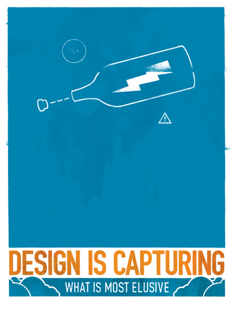
If I could choose to develop one skill that I don’t have I think graphic design would be high on the list. It’s so important for effective communication.

I like this collection of posters
.

Here are some of my favourites.

M a x K e r n i n g

Kudos to Aaran for posting this link in a comment. It’s awesome.

Max Kerning has dedicated his life to properly spaced type. His homepage is probably not something you want to visit with the sound turned up in your office. You can also follow him on Twitter.

He wrote a manifesto – called “Letters to Live By” which contains many useful typographic tips.

Like these:

“Typographic integrity cannot be feigned, and pretending with type only leads to disillusionment. Never, ever, ever fake condensed type. Do not try to create your own kerning pair when a master has already done it for you. Emulating a type style with a word processing button should never be done if the font includes a typeface in that style.

For example, you must not italicize Gill Sans when you can set it in Gill Sans Italic. It may seem like the same thing, but it’s impertinent and inconsiderate.”

It is not the shortening of words into grunt-like abbreviations that troubles me so. Instead, it is the fact that 96 percent of all written communications in the world contain words that by their very appearance dissuade people from reading them.

The reason more people do not glean wisdom from War and Peace is not because it is dull. The reason people only pretend to have read Ulysses is not because of the maddening run-on sentences and dearth of punctuation. No. Absolument non! It is because no one has taken the time and care to properly set the type, thus rendering the words useless.

Let us never underestimate the importance of kerning…

“To truly increase literacy, typography must be taught in even the earliest grades. If we do not instill in our young citizens the importance of properly set type— and the ability to kern—then we will perpetuate the cycle of creating literature with unattractive letter spacing that no one wants to read (and no one will read), causing people’s literacy to grow sloppy and feeble and atrophied.”

Font wheel drive

Some car loving boffins got together and decided to make a font. That’s right. A font.

Here’s a video.

iQ font – When driving becomes writing / Full making of from wireless on Vimeo.

Here’s the font.

Sans comic sans

Comic Sans was a font designed with a very specific purpose in mind – and it quickly outlived that usefulness.

If you use it regularly – and particularly in “professional” documents or presentations – please cease and desist.

If, like me, you’re frustrated by the use of this abominable font – visit bancomicsans.com and join the cause.

Guide to better working

Successful careers are a matter of working smarter not harder. I’m almost positive that’s the case. Every job has “short cuts” or tricks of the trade to make things easier. Here’s a collection of some of the best – from some obscure trades and some normal every day careers.

My favourites:

Mechanic

If you have to change a light bulb where the glass is broken, you can press a potato into the metal base to unscrew the remains of the bulb from the fixture.

Graphic Designer

If you have a client who is unable to approve a proposed design without putting her stamp on it, just put an obvious error in the proposal: a logo that’s too large, a font that’s too small, or a few judiciously seeded typos. The client requests the change and feels she’s done her part—and your design, which was perfect all along, sails through to approval.

Proofreader

If you’re reading too fast, your brain can “correct” typos, preventing you from catching them. That’s why it’s sometimes a good idea to read a page upside-down. It forces you to pay closer attention to individual words out of context, and you can’t race through pages too fast.

Poster post

This is pretty cool. A graphic design company has released a series of movie posters featuring the products “placed” in those movies as stars.