Tag: typography
Typography for Lawyers
After my typography post yesterday two funny things happened. My friend Amy sent me a link to Typography for Lawyers on Twitter, and Al, a former Lawyer, asked if there was anywhere he could learn more about typography. Look everyone. Synergy.
Check it out, you don’t have to be a lawyer to learn about typography from this website…

It’s full of handy advice.
Like this:
“Typography matters because it helps conserve the most valuable resource you have as a writer — reader attention.
Writing as if you have unlimited reader attention is presumptuous because readers are not doing you a personal favor. Reading your writing is not their hobby. It’s their job. And their job involves paying attention to lots of other writing.”“It’s the same on the printed page. The text matters, but if that’s all that mattered, then everything could be set in 12-point Times New Roman. And that would be the equivalent of staring at the lectern. In the same way that good speaking skills matter during an oral argument, good typography matters in a written document.”
“Good typography is measured on a utilitarian yard stick. Typography that is aesthetically pleasant, but that doesn’t reinforce the goals of the text, is a failure. Typography that rein forces the goals of the text, even if aesthetically unpleasant, is a success.”
And because it’s for lawyers he’s got a bunch of practical tips too.
Here’s his take on mixing fonts…
How to make a font palette
I like reading about typography. I’m pretty sure most of you don’t. But here’s a nice little guide to putting a bunch of fonts together on a design from fontsters Hoefler & Frere-Jones.

I won’t bore you with the all the details, but looking that good is expensive (those fonts combined cost over $400).
There are four principles in total. They’re expounded in the article.


Interactive intro to web typography
This is a nice little resource/essay that outputs typographic css for your web design.
“The mechanics of the em unit offer an excellent way to size child elements in relation to their parents. In fact, if every child element defines its sizing values in em, a chain reaction is set off. Each child becomes proportionally bound to its parent, which in turn is bound to its parent, all the way up to the root element, ancestor of all. In this way, the proportions of the whole document end up being defined in relation to a single, shared value: the font-size of the body.
Documents sized in this way enjoy a golden property, one that most web pages would do well to provide: proportional scaling. Should the user or designer change the base font-size, all the other elements on the page will resize accordingly, preserving their original proportion to the body. It will look as if the view has just been zoomed in or out. “
Fontasic cookie cutter
Everybody’s favourite font (Helvetica) can now be everybody’s favourite cookie word. What would Cookie Monster say about that?


They’re from designer Beverly Hsu, who is researching mass producing them. They’ll probably use a lot of dough though.
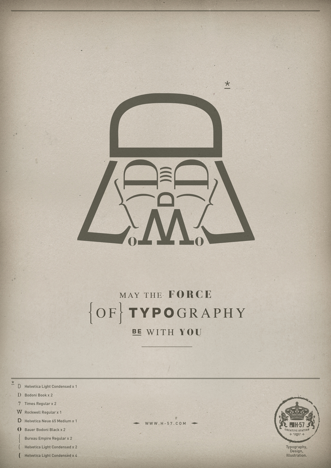
Typographic moustaches
If you want to make a type-face and need a good type-moustache here’s a handy guide to the moustaches produced by flipping the curly brackets ({) from popular fonts.

From here. You can buy it as a poster.
Reading between the lines: What the Oxford English Dictionary can teach us about typography
Dictionaries can be fun. This is an amusing article exploring the subject of typography through the archives of the Oxford English Dictionary.
“Take this 1688 quote for bake: “when Letters stick together in distributing… This is called the Letter is Baked.” So we learn that, when printing, the physical pieces of type occasionally stuck together, but we’re left to wonder why this happened, how severe it was, and how printers corrected it. Did baking ruin the type? Did each printer have his own method to prevent baking, a trade secret he passed down only to his apprentice? Did some Elizabethan Edison develop a method for casting type that eliminated baked letters altogether? These are the sorts of questions that the OED can raise, which can be investigated later (but will more likely just be blended in with the actual definition, creating a fictitious pseudo-history in the memory of the reader). Though sometimes the dictionary answers its own questions, as a similar citation for bake from 1963 shows that printers likely never overcame the issue of sticky letters.”
Here’s why the Oxford English Dictionary is cool:
“Indeed, the dictionary serves as an ad-hoc catalog of every experience that any English-speaking person felt interesting enough to write down.”
Comic Sans fights back in an expletive laced tirade
Comic Sans, the world’s most maligned typeface, has come out swinging via this imagined monologue from McSweeny’s Mike Lacher. A sample (the language is a little blue).
“You don’t like that your coworker used me on that note about stealing her yogurt from the break room fridge? You don’t like that I’m all over your sister-in-law’s blog? You don’t like that I’m on the sign for that new Thai place? You think I’m pedestrian and tacky? Guess the **** what, Picasso. We don’t all have seventy-three weights of stick-up-my-ass Helvetica sitting on our seventeen-inch MacBook Pros. Sorry the entire world can’t all be done in stark Eurotrash Swiss type. Sorry some people like to have fun. Sorry I’m standing in the way of your minimalist Bauhaus-esque fascist snoozefest. Maybe sometime you should take off your black turtleneck, stop compulsively adjusting your Tumblr theme, and lighten the **** up for once.
People love me. Why? Because I’m fun. I’m the life of the party. I bring levity to any situation. Need to soften the blow of a harsh message about restroom etiquette? SLAM. There I am. Need to spice up the directions to your graduation party? WHAM. There again. Need to convey your fun-loving, approachable nature on your business’ website? SMACK. Like daffodils in m********* spring.”
Anatomy of a typeface
Have you ever had a burning desire to understand typography better but not been sure where to start – this A to Z of font design has you sorted. It has pictures, and links to handy articles from Typedia.
Aperture: Opening at the end of an open counter.

Arm: A horizontal stroke not connected on one or both ends.

Ascender: An upward vertical stroke found on lowercase letters that extends above the typeface’s x-height.

If every logo looked the same…
I actually wouldn’t mind a world where every logo had to be produced using Helvetica. A vision put to the test here.


Classified posters
A bunch of designers were challenged to find, and redesign, classified adverts from their local rags. The finished products will be auctioned for charity. Here’s a sample.


Dynamic fonts are clever
I have seen the future of typography and its name is Liza Pro.

I’m sure there are other fonts that do this out there, but Liza has a character database of 4,000 letters – it will, in the right design software, change which version of a letter it uses based entirely on context.
“Liza Display Pro rocks the script lettering to the max. The build-in Out-of-ink feature, LetterSwapper and Protoshaper makes this font a realtime-digital-calligrapher. She’ll swash up your text drastically, giving long strokes, loops and swashes to letters if their context allows”
Clever. But expensive.
An ode to @
The @ symbol is so hot right now – almost as hot as block letters filled with a scribble effect. It’s so in that the New York Museum of Modern Art has added it to the Architecture and Design collection. Go @.
Here are some @ facts:
Let’s start by looking at the @. No one knows for sure when it first appeared. One suggestion is that it dates to the sixth or seventh century when it was adopted as an abbreviation of “ad,” the Latin word for “at” or “toward.” (The scribes of the day are said to have saved time by merging two letters and curling the stroke of the “d” around the “a.”) Another theory is that it was introduced in 16th-century Venice as shorthand for the “amphora,” a measuring device used by local tradesmen.
Whatever its origins, the @ appeared on the keyboard of the first typewriter, the American Underwood, in 1885 and was used, mostly in accounting documents, as shorthand for “at the rate of.” It remained an obscure keyboard character until 1971 when an American programmer, Raymond Tomlinson, added it to the address of the first e-mail message to be sent from one computer to another.
True type fans
I’m as big on good fonts and typography as the next guy. Just not as big on a particular font as these next guys…
Font in pens
That title was meant to be a pun based on “fountain pens” it probably fails because I feel the need to introduce the rather amazing concept behind this post with a non-sequitur. I could try to redeem this lede with some sort of segue – but perhaps I should just get to the point (pun intended).
A couple of designers have conducted an elaborate plot to measure the ink use of popular fonts. They did it by writing the word “Sample” on a wall with ball point pens and then photographing the pens once it was done.


It turns out Garamond is the best – but I’m not sure they considered ecofont.
