Tag: charts

Are visualisations essentially meaningless?

The internet is now saturated with infographics and visualisations. I’ve done my fair share of propagating this. So, at what point does this become meaningless clutter, rather than clarity cutting through the communication noise of the world wide web.

Who knows, but I’m starting to enjoy humourous visualisations more than the real thing… and so is the New Yorker.

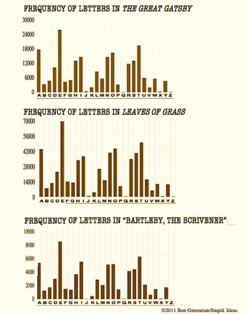
You could do worse than perusing some of the efforts of this guy named Ben Greenman.

This one is actually interesting, though largely pointless.
Data Visualisation: Break up season

A guy named David McCandless put together some data visualisations for a talk he gave at TED. You can watch it here.

But in my opinion, his really interesting research went into this graph of when people experience relationship break downs based on mentions of “break up” or “broke up” in Facebook status updates.

Here’s the graph (posted on Information is Beautiful):

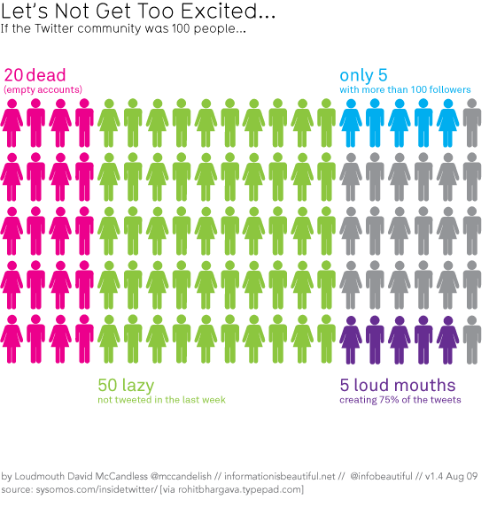
He also put together this cool “if Twitter was 100 people” visualisation that I’ve posted before (I think)…

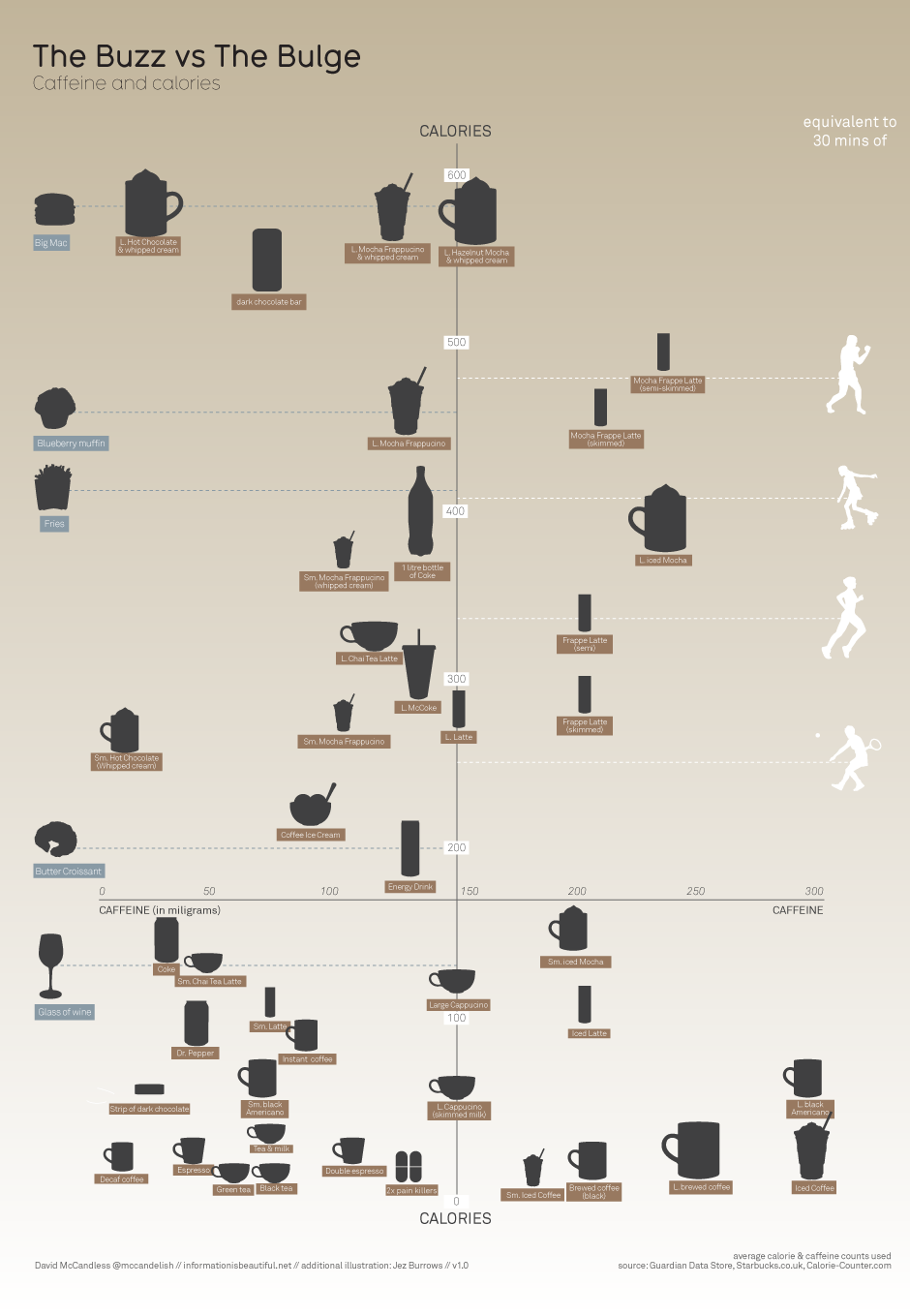
And this one on caffeine and calories, that I know I have posted before.


(Bigger)

Data visualisation is the future of communication – Christians need to think about how we can use it well to communicate the truths of the gospel.

Just a spoonful of sugar…

Have you ever wondered just how (un)healthy your daily caffeine fix is? For many of us coffee is modern medicine. And some people need sugar. But the more sugar you put in the worse it becomes for you. And nobody wants to be taking medicine that is bad for them. Which is why this little infographic is going to come in real handy.

Check out the full version here.