Tag: design

Designing the Word

This is incredible. A graphic designer, looking to come to grips with the big idea of books of the Bible is trying to put together a design based on each book. I’m sure it’ll be useful for your contempervant Bible Study books… These are some of my favourites.


Awkward Stock Photos

Have you ever used or searched through stock photo libraries just trying to find the right image for your design? I have. Stock photos are heaps cheaper than photo shoots, and a great way for photographers to make a little pocket money. Good stock photos are awesome. You can search for photos by obvious keywords.

There are, however, a litany of awful stock photos in libraries around the interwebs. This blog, Awkward Stock Photos, exists to record the worst offenders.

One wonders what possible application this image has, and what keywords one would be using to find it: “criminal school girl with walkman and balaklava” is hardly likely to be a common request.

This one is too disturbing to feature in image form – only click it if you can stomach artistic elderly nudity (a bottom) in anatomically impossible situations.

Colour me “tickled pink”

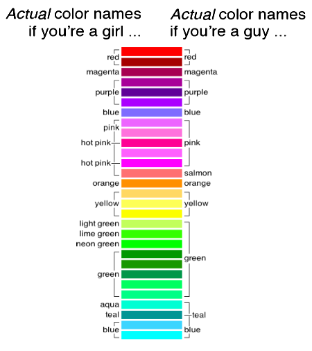
The XKCD man, Randall Munroe, conducted a big survey on colour identification and gender. He found that the difference between men and women on colour recognition has been greatly exaggerated.


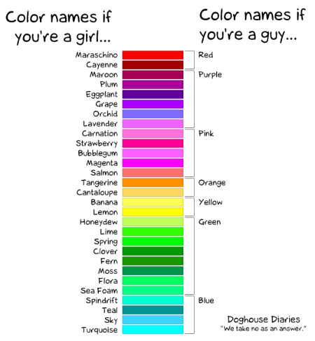
Contrary to this DogHouse Diaries Comic:

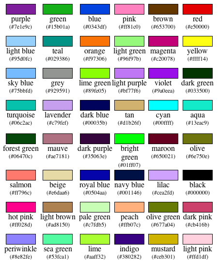
He also gives a nice guide to common colours and their hex codes based on the survey results.


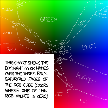
He created a colour map too, which is helpful for colourblind people like me.

Dynamic fonts are clever

I have seen the future of typography and its name is Liza Pro.

I’m sure there are other fonts that do this out there, but Liza has a character database of 4,000 letters – it will, in the right design software, change which version of a letter it uses based entirely on context.

“Liza Display Pro rocks the script lettering to the max. The build-in Out-of-ink feature, LetterSwapper and Protoshaper makes this font a realtime-digital-calligrapher. She’ll swash up your text drastically, giving long strokes, loops and swashes to letters if their context allows”

Clever. But expensive.

An ode to @

The @ symbol is so hot right now – almost as hot as block letters filled with a scribble effect. It’s so in that the New York Museum of Modern Art has added it to the Architecture and Design collection. Go @.

Here are some @ facts:

Let’s start by looking at the @. No one knows for sure when it first appeared. One suggestion is that it dates to the sixth or seventh century when it was adopted as an abbreviation of “ad,” the Latin word for “at” or “toward.” (The scribes of the day are said to have saved time by merging two letters and curling the stroke of the “d” around the “a.”) Another theory is that it was introduced in 16th-century Venice as shorthand for the “amphora,” a measuring device used by local tradesmen.

Whatever its origins, the @ appeared on the keyboard of the first typewriter, the American Underwood, in 1885 and was used, mostly in accounting documents, as shorthand for “at the rate of.” It remained an obscure keyboard character until 1971 when an American programmer, Raymond Tomlinson, added it to the address of the first e-mail message to be sent from one computer to another.

Font in pens

That title was meant to be a pun based on “fountain pens” it probably fails because I feel the need to introduce the rather amazing concept behind this post with a non-sequitur. I could try to redeem this lede with some sort of segue – but perhaps I should just get to the point (pun intended).

A couple of designers have conducted an elaborate plot to measure the ink use of popular fonts. They did it by writing the word “Sample” on a wall with ball point pens and then photographing the pens once it was done.


It turns out Garamond is the best – but I’m not sure they considered ecofont.

How to choose a contrasting colour

Apparently the key to a successful poster design (the type of poster that gets plastered all over city noticeboards) is a design that “pops”.

The key, according to this wikihow article, is to use contrasting colours.

They give this star shaped guide to picking two colours that contrast. You pick colours from opposite points. Done.

How to annoy your designer

One day everybody will read The Oatmeal and I won’t be compelled to keep linking to their comics.

Until that day comes here’s the frustration that designers feel on any projects – it’s not amplified when you’re the middle man between designer and those wishing to have input – but I can relate.

Here are some of the many highlights.

Intelligent design

So, how bout this new design…

Any comments?

Any obvious glitches?

The new logo was drawn by Ben back when I picked my new name… I like it. He has kindly given me permission to use it.

Shirt of the Day: You kern, do it

Ahh kerning. The art of bringing letters closer together… or tearing them further apart.

Here’s a shirt that celebrates the majesty of perfectly spaced typography.

Design through the ages

Designs change slowly. Incrementally. In every field – from breakfast cereal to book covers. Even the Queen’s hat has slowly evolved… Check out this progression from the Guardian

Just so you know…

Helvetica is a beautiful font. But if you’re going to use it in a heading it looks much nicer in bold.

Grunge grudge

Grunge is so 1990s. The music in particular, the aesthetic in general. I am so very sick of seeing invitations/flyers/advertisements/websites designed with a grungy aesthetic. It’s usually done by people with no real appreciation of the sub culture they’re advertising to (ie the iGen boys and girls in their tight jeans and stupid faux 80s haircuts with bits that have obviously been missed by the hairdresser).

Grunge is cool if you’re in Seattle and either the pastor of a megachurch or a founding member of Nirvana. Otherwise you’re pretty much a wannabe.

Next time you’re asked to design something to promote an event for the yoof can you please avoid the hackneyed dark colours, letters with bits missing and scant regard to horizontal and vertical aspects. Nobody thinks you’re cool anymore. We just think you’re trying too hard.

Trying new things

I’ve been tweaking my design a bit in my allocated blog time today – rather than posting. Check out the funky new drop down menu in the top right of the design, and first time (and regulars coming back for the first time) visitors will get a nice little welcome message from now on.

Try it and tell me what you think.

Off to opening night of the Australian Festival of Chamber Music now. I’ll come back more cultured, but don’t worry, I’ve got a heap of trivial things to post tomorrow to get you through your weekend.

Bummer

Yes, this is what the world needs. The iBum. A chair that photocopies your bum. From this Japanese designer – Tomomi Sayuda – who says:

"The arse is the window of the soul."

Honestly? What’s wrong with sitting on the photocopier? Back in my day if you wanted a picture of your bum you sat in front of one of those charcoal drawers at the markets – now it’s all new fangled camera phones and mirrors, or chairs that take all the hard work out of things…