Tag: design

Something’s afoot(er)

You may have noticed a lack of posts today. I have an excuse – scroll to the bottom of the page and check out the new, improved, footer.

I’ll be playing with it a little more as time allows (and I’m still trying to get archived pages to actually work).

I’m watching the cricket tonight. It’s the first night of cricket that I haven’t had something on the next day. It’s nice. Robyn’s asleep on the couch, the fish tank is bubbling away… so much serenity.
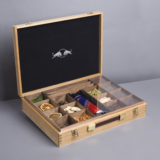
It’s what’s inside that counts

Red Bull gives you wings. Apparently. If you believe all the hype. If you’ve ever wondered what’s in it DesignFriendship has the answer… via LovelyPackage

Stylised Sarcasm

Interesting idea. I’m going to recode my website so that when I am being sarcastic I can use HTML and CSS to indicate it. Sarcasm will, when I’m ready to launch it, come out in blue. Or something.

Someone suggested that a Sarcasm tag be included in the next HTML standard.

Design brief

I have a new design – that’s obvious for those of you visiting – but for the subscribers you should perhaps stop by and check it out.

Robyn doesn’t like it though – so I may have to change it if I want her posting more often.

Also, apparently commenting is difficult for some people (not the general vibe but a specific) – I think it’s got something to do with the OpenID plug-in I’m using. If commenting has been a problem – can you try commenting on this post without including a website in the website field – that will confirm my suspicions if it works.

Oh yeah, feedback on the design/design issues would be more than welcome.

Design brief

I’m thinking about changing my design again, it’s not that I’m dissatisfied with this one, I just like that I can.

Does anybody have anything they’d like to see incorporated in the new design – or lost from the current one?

Got Milk?

This is a novel take on the idea of “literal packaging“…

These fruit juice cartons follow a similar, but slightly varied theme.

Amy mentioned that she’s a sucker for a well designed product package – so no doubt she’ll be ordering up big on fruit juice if these ever hit the shelves.

Redesign

Dear feed readers – do youseselves a favour ay and check out the all new design of the still amazing and cool http://nathanintownsville.com.

I don’t want to brag, I made it myself. By myself. Using a piece of nicely designed design software called artisteer and then doing some coding stuff myself. Oh, and if you happen to use artisteer without buying the real version it’s pretty easy to remove the “trial” watermark they put all over your site.

You’ll also notice that I’ve moved to a two column design and now my much more frequently posted “oddities” from around the interwebs will appear on the right hand side only. Keeping the more serious stuff on the left.

This is because my wife told me she was sick of trawling through the odd bits to get to the good bits. Other people no doubt only read me for the odd bits so hopefully I’m keeping you all satisfied.

Nice rug

rug

This is part of a collection of very expensive novelty rugs from Dan Golden. I like it because it’s making fun of bad doctrine.

That is all. For now.

Crystal clear pool

Speaking of beautifully designed things… Gizmodo just posted a link to this Aussie designed glass pool table – complete with a special surface that emulates the friction and movement of felt. The privilege of having this bad boy in your living room will cost you a cool $38,000 or thereabouts. But hey, Plasma televisions cost that much back in the day – and look at them now.

Ecofont: where less black is the new green

I may have posted this as one of my reader items from the last week or so – but if you’re seriously concerned about cutting environmental corners wherever you can ( so you can drive a 4WD or commit other justifiable environmental homicide), then this is the font for you. It’ll possibly save you money too.

Ecofont - inspired by silkworms

Ecofont - inspired by silkworms