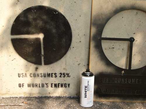
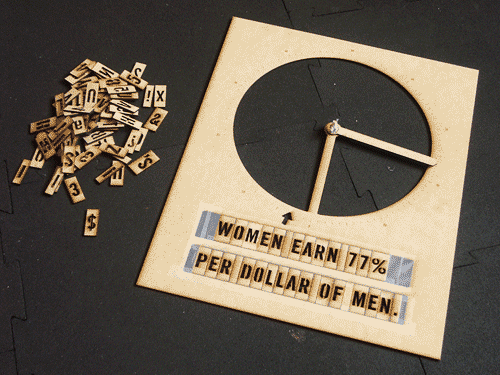
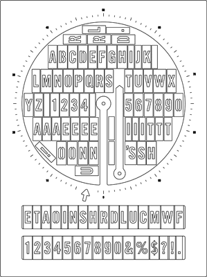
Want to make a political statement on the streets in the form of a pie chart? I know I do. Want to do it in regulated (and regulation) stencil style? Just download this handy PDF, grab some spray paint, and hit the streets.*
You’ll need:
1/8″ (3mm) thick sheet material, suitable for lasercutting. I used MDF, but acrylic is fine.
A one-inch 1/4″-20 bolt, wing-nut and suitable pair of washers.
Scotch tape or masking tape (to hold the letter in the stencil)
1 quart-capacity Ziploc bag (for storing the letters)
Spray paint
A laser cutter! (or a really steady hand and a sturdy knife)
*Actual hitting of streets and actual graffiti is neither endorsed or encouraged any reference to such behaviour is figurative and st-eutychus takes no responsibility for any consequences if you choose to enact said ideas literally.
A guy named David McCandless put together some data visualisations for a talk he gave at TED. You can watch it here.
But in my opinion, his really interesting research went into this graph of when people experience relationship break downs based on mentions of “break up” or “broke up” in Facebook status updates.
I’ve never had a good experience with printers. They never work. They are frustrating. And worst of all… they are expensive. The Oatmeal has an exploration of printer frustration – this is my favourite.
This graph – via Boing Boing Gadgets (and I think originally from Gizmodo) – compares ink prices to other liquids.
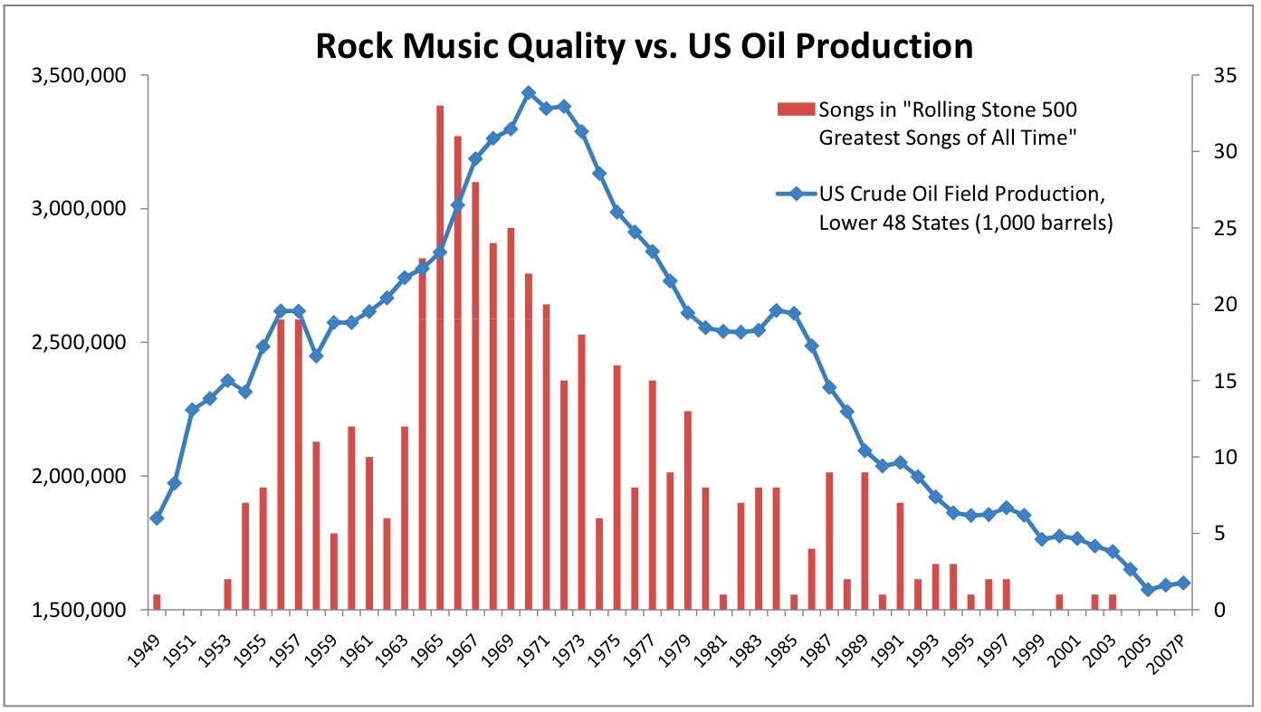
“First, a little theory. The decline in U.S. oil production* is explained by the Hubbert Peak Theory, which states that “the amount of oil under the ground in any region is finite, therefore the rate of discovery which initially increases quickly must reach a maximum and decline.” Makes sense, right? The same theory can apply to anything of a finite quantity that is discovered and quickly exploited with maximum effort.
Including, it would seem, rock & roll. I know, the RS 500 list is not without its faults, but it does allow for some attempt at quantifying a highly subjective and controversial topic and for plotting the number of “greatest songs” over time. Notice that after the birth of rock & roll in the 1950’s, the production of “great songs” peaked in the 60’s, remained strong in the 70’s, but drastically fell in the subsequent decades. It would seem that, like oil, the supply of great musical ideas is finite. By the end of the 70’s, The Beatles, Led Zeppelin, Black Sabbath, the Motown greats, and other genre innovators quickly extracted the best their respective genres** had to offer, leaving little supply for future musicians.”
Graphjam is fun. More fun on PCs than Macs – for some reason I couldn’t save the ones I made yesterday to graphjam’s servers. Today, on the other hand, I’ve managed to put one there for the world to see.


More graphically speaking
Graphjam is fun. More fun on PCs than Macs – for some reason I couldn’t save the ones I made yesterday to graphjam’s servers. Today, on the other hand, I’ve managed to put one there for the world to see.
This is what it looks like.
If the awesomely persuasive power of graphs isn’t enough to get you people commenting, I don’t know what is…
August 18, 2009