While you can be a real life superhero for the cost of some kevlar body armour and some lycra, being the real deal, ala playboy superheroes (as in the type who are single and wealthy, as in Batman or Iron Man), is apparently a costly exercise. The other day io9 worked out what it would cost to be Iron Man, and moneysupermarket.com pulled together these two infographics.
Tag: infographics
A grammatical breakdown of Steven Seagal movie titles
My love for Steven Seagal, and his catalogue of movies, knows only some bounds. A late night Seagal movie kills sleep for me like Steven Seagal kills the bad guys.
Anyway. Check out this infographic from Pop Chart Labs (big version).

The Extreme Improbability of Your Existence
What is truly bizarre is that there are those who use extreme improbability to argue against the existence of God. I saw Richard Dawkins essentially make that argument in Brisbane last year… anyway. Mind. Blown.
You are a miracle.

Via BoingBoing
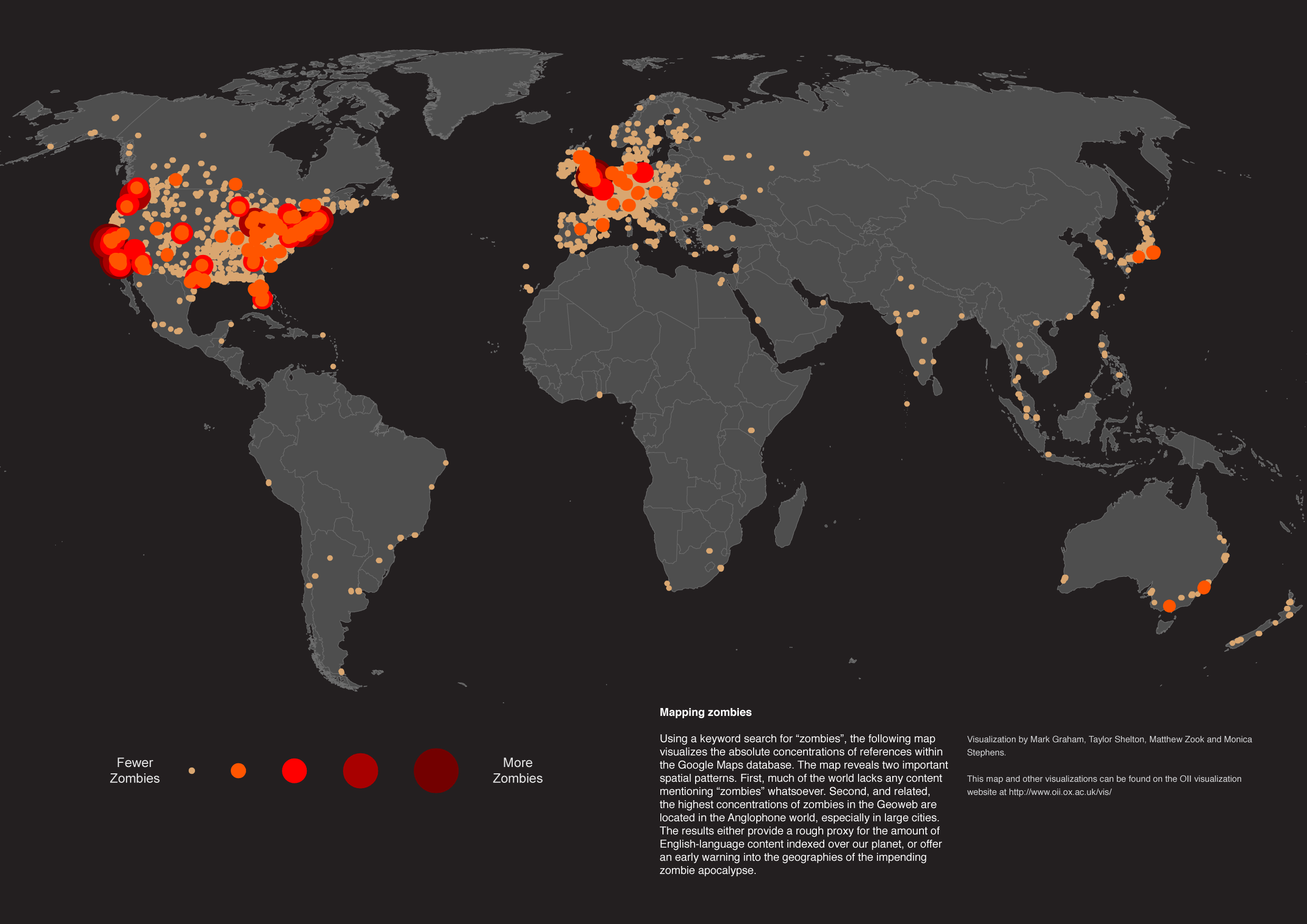
Where in the world do people care about Zombies?
The answer – pretty much where Hollywood movies are common fodder… based on the location of google searches anyway… big circles indicate lots of searches.
From the University of Oxford’s Data Visualisation page. Via Gizmodo.
Are visualisations essentially meaningless?
The internet is now saturated with infographics and visualisations. I’ve done my fair share of propagating this. So, at what point does this become meaningless clutter, rather than clarity cutting through the communication noise of the world wide web.
Who knows, but I’m starting to enjoy humourous visualisations more than the real thing… and so is the New Yorker.
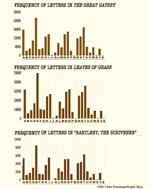
You could do worse than perusing some of the efforts of this guy named Ben Greenman.


This one is actually interesting, though largely pointless.

Low-fi Visualisations
Infographics and data visualisations are such powerful communication tools. And it turns out you don’t need a graphic design degree, or even necessarily a computer, to produce them…
Check these “State of the Internet” visualisations out…

For the purpose of this exercise I’m more interested in the style than the accuracy of the data (the numbers here don’t even add up).

They’re made using this infographic tool kit.

Love it. Thanks to Arthur for the link (via Facebook).
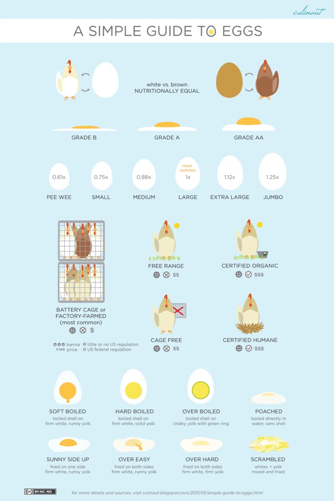
A visual guide to eggs
I love eggs. Especially with bacon. You all know all of this already, but I like the design. So there.

From Culinaut.
Cocktail Infographics in 3D
You might remember the Engineer’s Guide to Cocktails… well, this is a nicer version.


More here (where you can buy it as a poster). Via FlowingData.
The power of a good visualisation
Nuclear power. Two words, that when combined, are guaranteed to polarise. Especially now. I’m ambivalent on the issue. It seems like a good idea, until things go wrong. But the other day Seth Godin posted this little visualisation of some real data that is effective in its ability to frame the debate.
He puts the dissonance between opinion and reality down to the influence of coal marketers. Which opens up an interesting can of worms in the energy debate. I’m nonplussed about the debate, I’m more interested in the simplicity of turning data into a visual and the persuasive power that has.
Here’s what Godin says is the underlying reason this visual has the impact it has:
“I think that any time reality doesn’t match your expectations, it means that marketing was involved. Perhaps it was advertising, or perhaps deliberate story telling by an industry. Or perhaps it was just the stories we tell one another in our daily lives. It’s sort of amazing, even to me, how much marketing colors the way we see the world–our reaction (either way) to this chart is proof of it.”
There’s truth in that, but there’s also truth in the idea that the simplicity of a graphic like this one is a much more powerful manner of persuasion than the complication of talking about figures and research. That has always been the case, but the way the Internet works (this visualisation has gone, and will continue to go, all over the internet) means that a simple picture like this cuts through in a way that numbers don’t.
Dr Who: By infographic
Do you like Dr Who? I don’t really. I have some bizarre childhood memories of how scary daleks were – but haven’t really gotten into the modern resurrections of the time lord. Sacrilege, I know. So here’s a handy cheat sheet via the Internet…

From ForeverGeek – though I think I saw it at DavidOuld.net.
iPhone Users: an infographic

I think I might be a fanboy. Though I suspect there is a bit of overlap between some of the categories.
From here.
The Trustworthiness of beards: A sliding scale
Some beards good. Other beards bad.

At the moment I’m hovering around “Questionable” and I always will. Because my mo won’t grow.
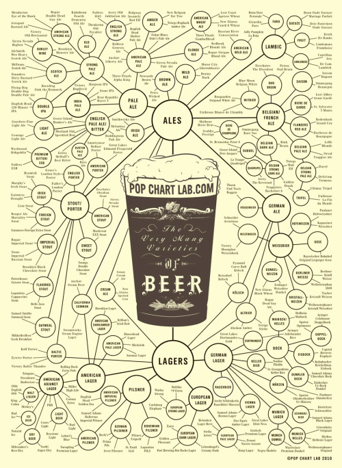
From PopChartLab.


