This is pretty cool – though in the US. GPS tracking on delivery trucks opens up some pretty fun possibilities for this sort of thing.
Tag: visualisations
On the relationship between correlation and causation…
While Michael Bay’s cinematic success and the number of explosions in his movies probably do represent a causal link, such incredible examples of correlating data points in different sets aren’t always linked. As demonstrated by these graphs from Business Week.

The Extreme Improbability of Your Existence
What is truly bizarre is that there are those who use extreme improbability to argue against the existence of God. I saw Richard Dawkins essentially make that argument in Brisbane last year… anyway. Mind. Blown.
You are a miracle.
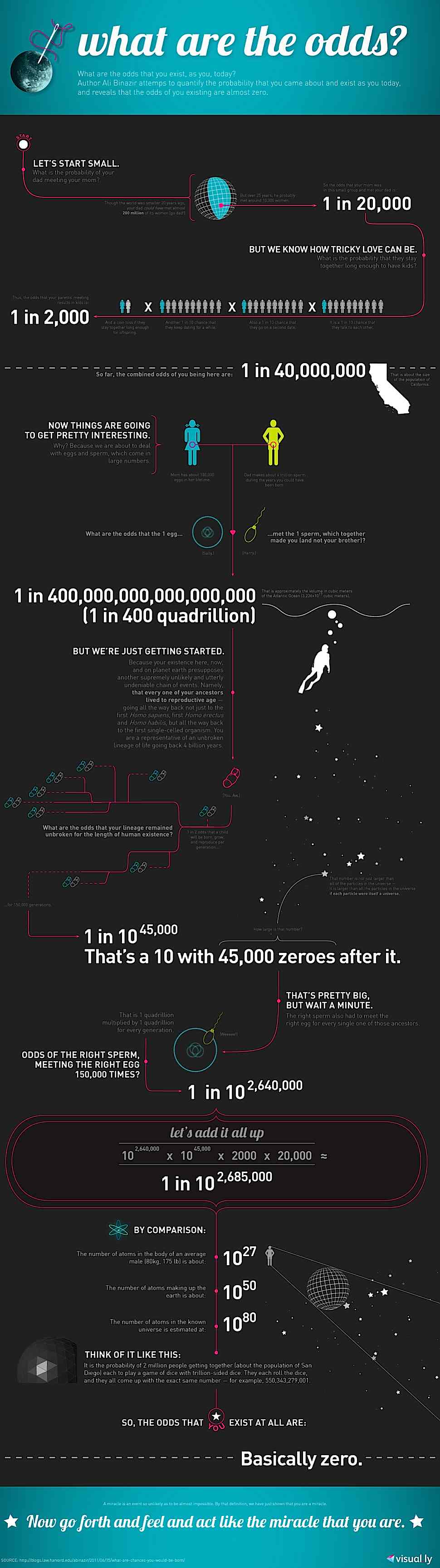
Via BoingBoing
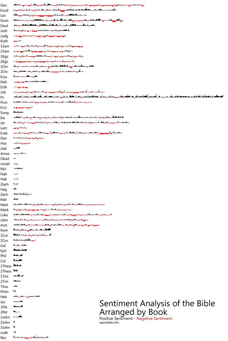
Two fascinating and possibly useful Bible visualisations
This is quite an interesting way to chart the progression of the Biblical narrative. A “sentiment analysis” from OpenBible.

Here’s the methodology applied to produce these graphics.
“Sentiment analysis involves algorithmically determining if a piece of text is positive (“I like cheese”) or negative (“I hate cheese”). Think of it as Kurt Vonnegut’s story shapes backed by quantitative data.
I ran the Viralheat Sentiment API over several Bible translations to produce a composite sentiment average for each verse. Strictly speaking, the Viralheat API only returns a probability that the given text is positive or negative, not the intensity of the sentiment. For this purpose, however, probability works as a decent proxy for intensity.”
From a cursory analysis the modelling adds up to most understandings of Biblical theology – except perhaps that exile isn’t as confronting emotionally, or as dire and depressing, as we might have thought – probably because most exilic texts include expressions of hope for delivery.
Here’s the sentiment analysed on a book by book basis.
Where in the world do people care about Zombies?
The answer – pretty much where Hollywood movies are common fodder… based on the location of google searches anyway… big circles indicate lots of searches.
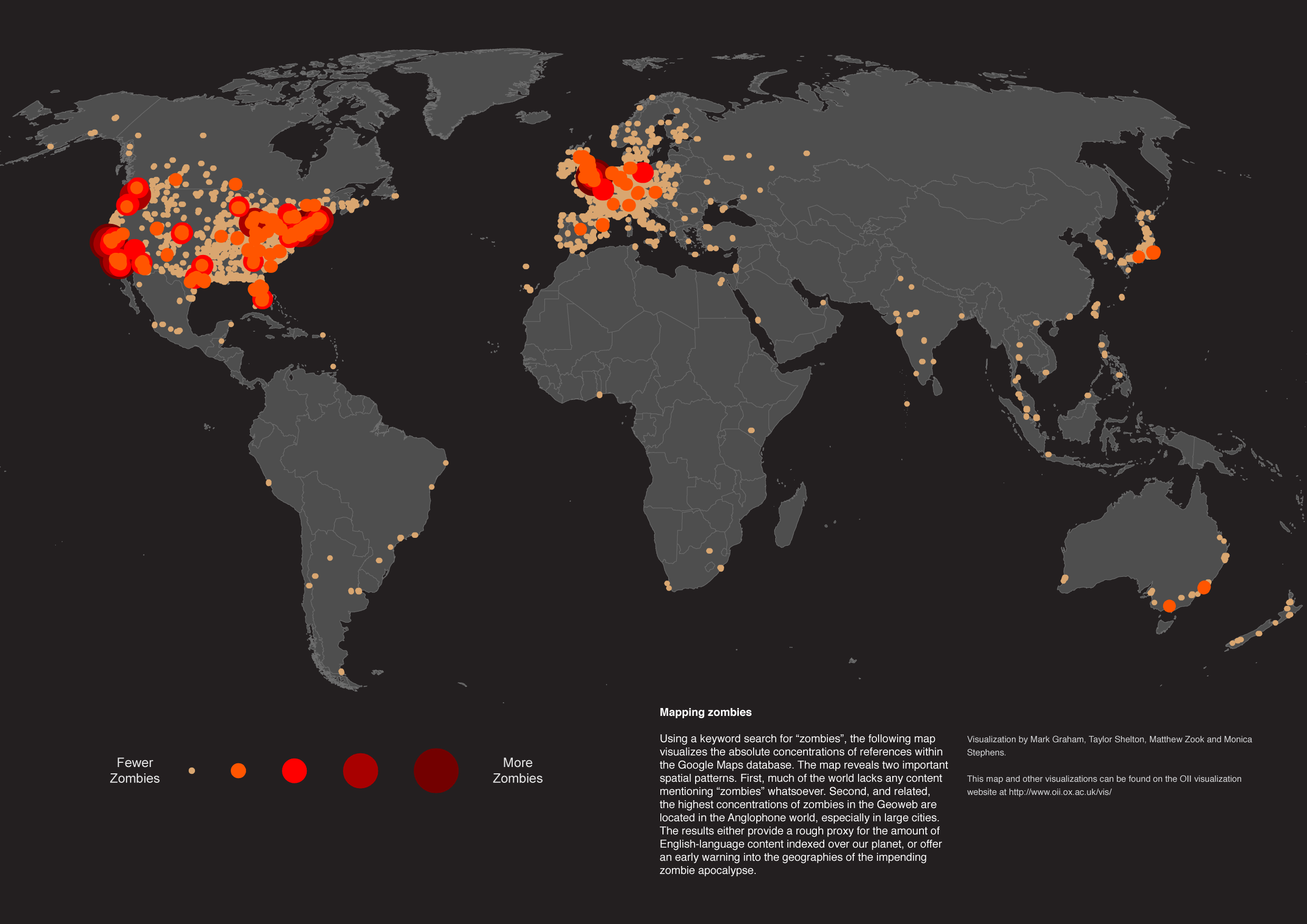
From the University of Oxford’s Data Visualisation page. Via Gizmodo.
Tumblrweed: When the What
Chronological visualisations on graph paper. Need I say more? Possibly. But seeing it will make things much clearer. When the What.


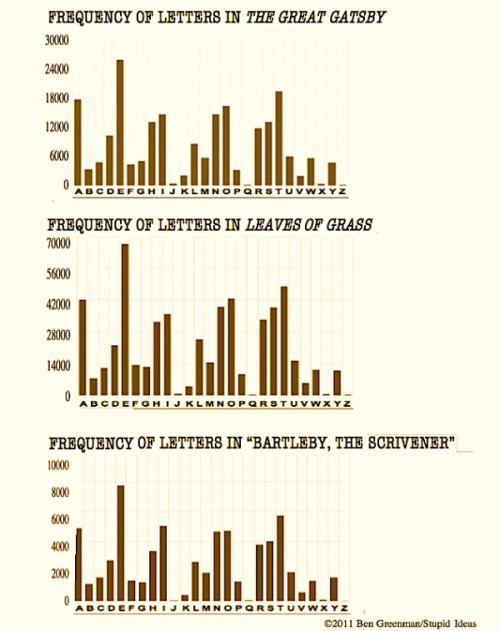
Are visualisations essentially meaningless?
The internet is now saturated with infographics and visualisations. I’ve done my fair share of propagating this. So, at what point does this become meaningless clutter, rather than clarity cutting through the communication noise of the world wide web.
Who knows, but I’m starting to enjoy humourous visualisations more than the real thing… and so is the New Yorker.
You could do worse than perusing some of the efforts of this guy named Ben Greenman.

This one is actually interesting, though largely pointless.
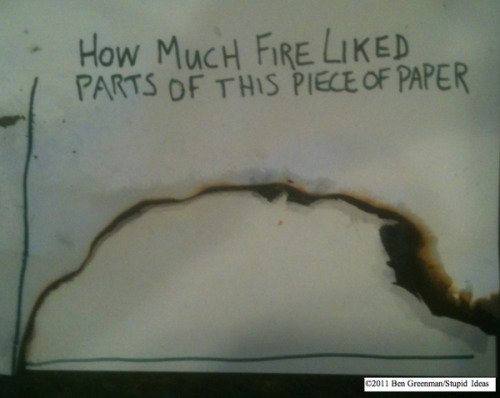
Low-fi Visualisations
Infographics and data visualisations are such powerful communication tools. And it turns out you don’t need a graphic design degree, or even necessarily a computer, to produce them…
Check these “State of the Internet” visualisations out…
For the purpose of this exercise I’m more interested in the style than the accuracy of the data (the numbers here don’t even add up).

They’re made using this infographic tool kit.

Love it. Thanks to Arthur for the link (via Facebook).
A visual guide to eggs
I love eggs. Especially with bacon. You all know all of this already, but I like the design. So there.
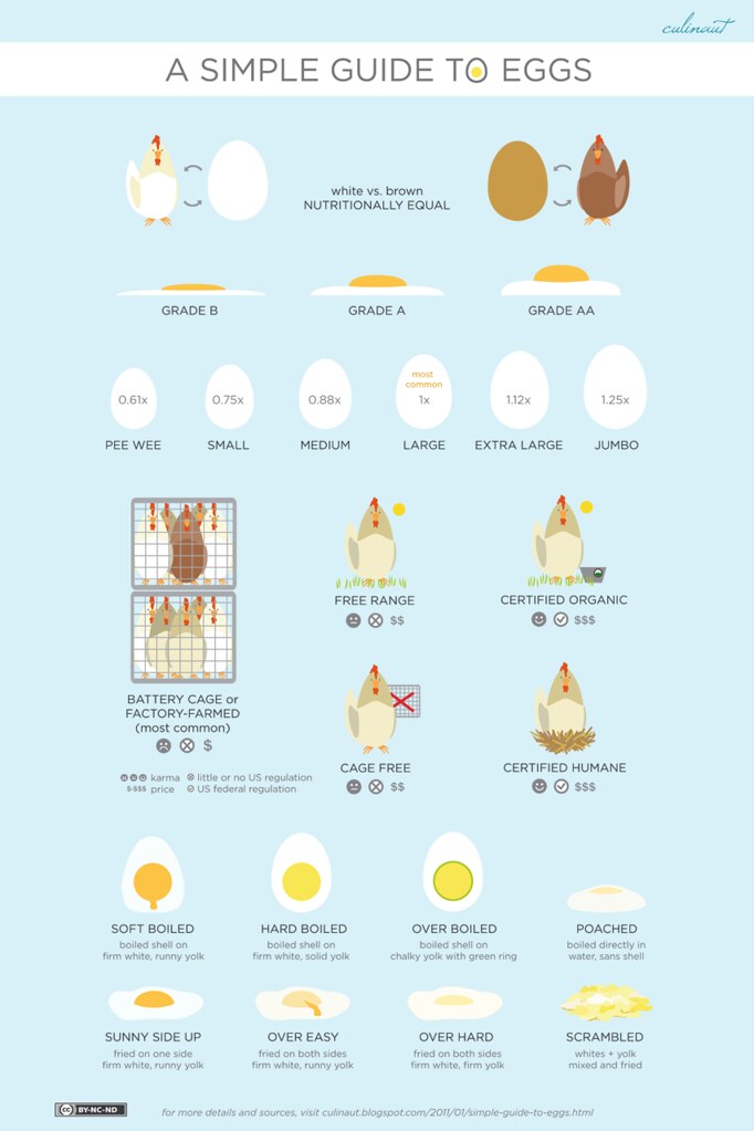
From Culinaut.

Cocktail Schematics
My neighbour is an engineer. And when he had a cocktail night a couple of weeks ago he pulled out this Engineering schematic for popular cocktails (from here – where it is bigger).
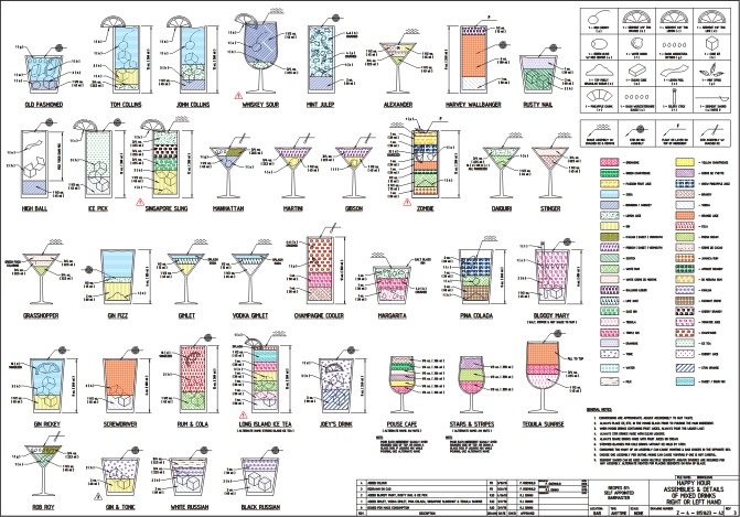
That’s all well and good. But these Flickr visualisations exist for the rest of us (ie those who can’t read technical drawings).


Build your own horoscope
It turns out writing horoscopes is really, really, easy.
Information is Beautiful posted this great breakdown/wordcloud from 4,000 horoscopes.

It can’t be too hard to string a sentence together with a few prominent words. So write one in the comments, here’s mine:
“You will sure feel better if you use your mind”
Charting the social acceptability of peeing in public
This is no laughing matter. It’s serious sociology people. Get with the program.
So, because you all need to think more deeply about your innate desire to pee in public, here’s a graph representing the social acceptability of said action (or other peeing related actions) and the outcomes of such pressure on your bladder. This social pressure creates real pressure.
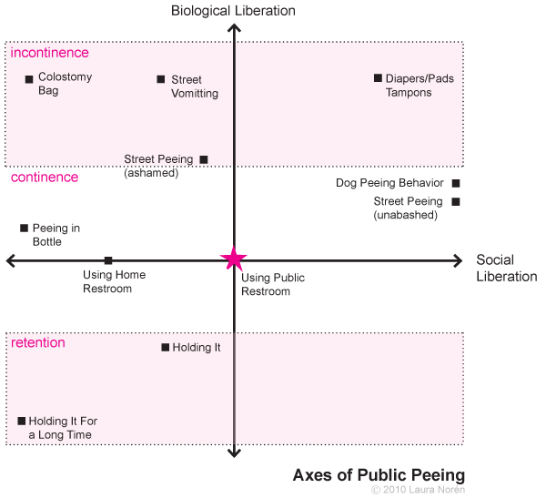
From the artist/sociologist:
This was something I used to help me think through the two main axes that determine peeing behavior – biological and social control. Urination is a biological function that has been subjected to a great degree of social control. Unfortunately, urban design has not kept pace with the demand for clean, easily accessible public restrooms for humans. And there has been no attempt to create any kind of system to deal with canine urine. In most cities it is illegal for humans to pee in public but both legal and widely accepted for dogs to pee where ever they like (in New York, they cannot pee on the grass in parks).
Bold, and beautiful, visualisation
The Bold and the Beautiful in 6 minutes. Contains adult themes. And stupidity.
Thanks Cafe Dave.
Contradictions v Cross-References: Does the Bible present a coherent picture
Someone on a comment thread discussing the “Contradictions” visualisation I posted yesterday pointed out that it’s remarkably similar to this visualisation of cross references I posted ages ago from Chris Harrison. Lets have a look at them together… I had remembered this cross reference one at the time, and thought it interesting that they took the same approach to presenting the graphic. But given both have presented their data sources, I’m not suggesting plagiarism (the atheist one acknowledges the influence of the other one). There are 63,000 odd cross references in the colourful one, and only 419 contradictions in the red one… but the shapes are very similar. Aren’t they.

It is interesting though, that one speaks to the internal consistency of the Bible while the other presents apparent discrepancies. Could it be that Sam Harris and his designer have a better take on the nature of interactions between texts in the Bible? I doubt it.