We’re rethinking our website at church. It’s exciting. We’re looking at changing everything from the Content Management System (CMS), to the content itself – how we distribute it, where we pull content from, and the type of content we’re aiming to produce.
Did I mention it’s exciting.
I’ve spent the last few days thinking about what a church website should do – and looking at a bunch of other churches, and then we had a great meeting this afternoon. And I’m excited.
As is the case in any communication, or marketing, the first step is thinking about who you are communicating to, and in this case – who our website is for. We’ve decided that it’s largely for the newcomer. And when it’s not for the newcomer directly, it’s for helping people who are already part of our church family connect their friends with Jesus, and Creek Road.
We can cut loose a bunch of traditional (and slightly boring) church website information. You won’t find pitches for money, or mentions of our “diaconate,” or the inner workings of our Committee of Management, Session, or Presbytery.
We’ve invested in The City, which is a combined intranet/social network/church database solution/communication tool for people who are part of our church family, and while the website will still be useful for our members – we’re really keen for it to be a useful tool where we can be confident that someone who hasn’t come through the doors of our church, or any church, will get a good feel for who we are, what we believe, and what a Sunday might feel like.
We consider it part of our “Connect” ministry (Creek Road uses a Connect, Grow, Serve ministry pathway which helps us figure out what we do and don’t do, and provides a bit of clarity for people in terms of where we expect people to head when they plug-in, or connect, with our church). This means we ditch a lot of the in house stuff (or move it to The City), we’re going to avoid buzzwords and jargon wherever possible (so always), and we’re not going to talk about giving, or have notices, announcements, or other boring stuff (we will have two blogs that will occasionally cover some of this stuff, more on that later…).
We’re also keen for our kids and youth programs to have their own sites, or sub-sites, which serve much the same purpose for kids, youth, and their parents.
Finally, we’re pretty keen to use the human resources we have to produce resources for churches that don’t have the same number of people working together to produce all sorts of things – from Bible Study books, to kids material, to videos, to song selection for congregational singing – we want to be making our stuff easily accessible for other churches…
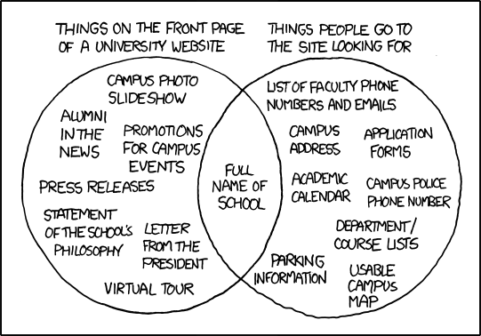
Add these things up and we’re starting to make for a pretty complicated landing page, which is potentially so jumbled it’ll make your eyes bleed.
And we don’t want that. Visual clutter and bad information architecture is the enemy of the newcomer.
Having our audience in mind means we’ve got a bit of clarity in terms of what we’ll be including.
I’ve been trying to narrow down a list of the minimum number of elements I think our site should have on the homepage, and I’m pretty committed to the usability theory I read once that suggested if a page is buried more than three clicks into your page design then it’s unlikely people are going to bother.
Here are my thoughts, there’s a gallery of other websites I’ve been looking at in producing this at the bottom of this post.
Though the Internet is an ever-evolving visual feast, I also like thinking of web pages, effective web pages, as Newspaper front pages – the Newspaper has evolved based on how people read things, and what draws the eye – it seems silly to waste all that time and investment just because we can.
So I think the basic structure of a home page should be something like:
- Masthead – Logo, Name, Address
- Banner Menu – Key pages, the stuff that helps people decide if they want to buy your paper or not.
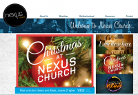
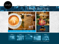
- Lead/Featured Story – Headline, Big photo.
- Smaller stories – still important, but at this point you’ve hopefully grabbed the attention of your readers.
We also want something that can be dumbed down for mobile browsing relatively easily. So the less content on the front page the better.
When it comes to the internal pages, we’re wanting a split between video and images and text – and we want the page to be driven by people’s stories, not us blowing our own trumpet.
I mentioned in the opening paragraph that one of the things we’re thinking through is where we’re pulling information and content from, where we’re creating it, and where we’re sending it… here’s a quick snapshot of what that’s about before we get to what I’m thinking page design wise (this isn’t revolutionary stuff).
Content Sources
Video – We’re going to be posting videos to YouTube and Vimeo, which we’ll then embed on our site. Posting them elsewhere means our hosting overheads are lower, but it also puts the videos in a format and context people are more familiar with, and allows our visitors, and members, the freedom to share, or interact with the content on other social networks in a way they’re used to.
Images – Much the same way, we’re thinking about how we use Instagram, and older more boring sites like Flickr, the added benefit of hosting images, well tagged (ie with good metadata etc), off site, is that these platforms usually rank better with search engines than your site (this is something a Digital Consulting team told me once – Google may have changed their approach since then). There are other sound reasons for hosting things on other platforms – multiplying your presence across the web on platforms people already use is a good thing.
Blogs – we’re committing time and energy to a blog content strategy, and we’ll be producing and scheduling the material well in advance. There’s nothing worse than a corporate, or church, website with a stagnant blog, but we’ve got some ready made content with weekly podcast/sermon bits and pieces, book reviews, video material, and other things that we’re already creating, to keep a steady stream of up to date content hitting the interwebs. The plan is to have two blogs – one for our visitors, to get a good sense of what happens at church in byte sized chunks (see what I did there…), and one for people we’re hoping to benefit with our resources, which will outline some philosophy of ministry type stuff for the extra-curious church shopper.
The idea is that the content we’re producing is both:
- modular enough and valuable enough to be shared by itself – by our members to their social networks to invite their friends along to church or give them a good understanding of the church they’re part of;
- and integrated enough (using links between posts, thematic and series type links, etc) that when you land at one post you’ll be pulled through to others and get a feel for what we’re on about.
Distribution Channels
While the website is, itself, a distribution channel, we want to push content out from it to other places, so that people can share and interact with our posts in those environments – that’s particularly related to how Facebook works.
These channels, at this point, include Facebook, Twitter, the City, and email. The first three are relatively straightforward posting of links with appropriate commentary to those channels. The email stuff includes offering email subscriptions to the blogs, and the functionality for people to send anything they want from our page to their friends, via email, and specially made email invitations for each sermon series.
The Design
Above the Fold
This is the part of the page that people see without scrolling – in newspaper terms the fold was literal, and this was the stuff people saw when they glanced at a pile of newspapers at the newsagent.
This isn’t set in stone – not simply because code is much more flexible than the old school chisel, or even, to keep the metaphor running – the press room – but because this is a work in progress, and we’ll keep working on the website so that it delivers the results we’re looking for – people coming through our doors saying it was helpful. Foot traffic – rather than web traffic.
The other good newspaper principle to apply is the old “inverted news pyramid” – putting the important gear first, and answering the: “Who?” “What?” “Where?” “When?” “Why?” “How?” questions for people as quickly as possible, and as early as possible.
Because the website is a connect tool – or a marketing tool – we also want to answer the big marketing question – the “what’s in it for me” or “where do I fit” question.
Masthead
This will have our logo, which, for us, incorporates our name, and I’d suggest it’ll have our address and service times as some sort of subheading – this is the information people will be searching for on their smartphone, in their car, as they’re running late for the first time they come to church, so it’s nice to frontend it.
Banner Menu
Each of the pages this banner links to needs to carry the story about our church through stories told by people who are part of our church. People like reading about, and thanks to the power of the YouTubes, watching, stories about real, relatable, people. We want our website to feel real and relatable, and to really relate to what goes on on a Sunday (or during the week at our other programs).
1. What we believe – A page about the good news of Jesus, and a little introductory blurb to Creek Road’s application of the gospel – we’re committed to the Bible, we teach it clearly, we want to connect, some basic info about the pathway, and our kids and youth programs etc. This will probably feature our reach the city, reach the world, video.
2. New here? – An invitation to join us at church, and to meet us in the Connect Lounge after the service, a contact form if they have questions or want us to look out for them, and some information about how the website might be useful for them as they investigate Jesus and us. This will probably include a bit of a video tour of a Sunday at Creek Road, with quick sound bites from across the demographics of our church family.
3. Where and When – A page dedicated to service times, and our location (which will also be below the fold on the front page).
4. Kids – a link to our Kids Ministry Page.
5. Youth – a link to our Youth Ministry Page.
6. Podcast/Vodcast – a link to the page which will collect our sermons and the linked Bible study books that go with them in both video and audio format.
7. Contact Us – contact details – including a phone number, links to our presence elsewhere, an enquiry form.
Featured Story
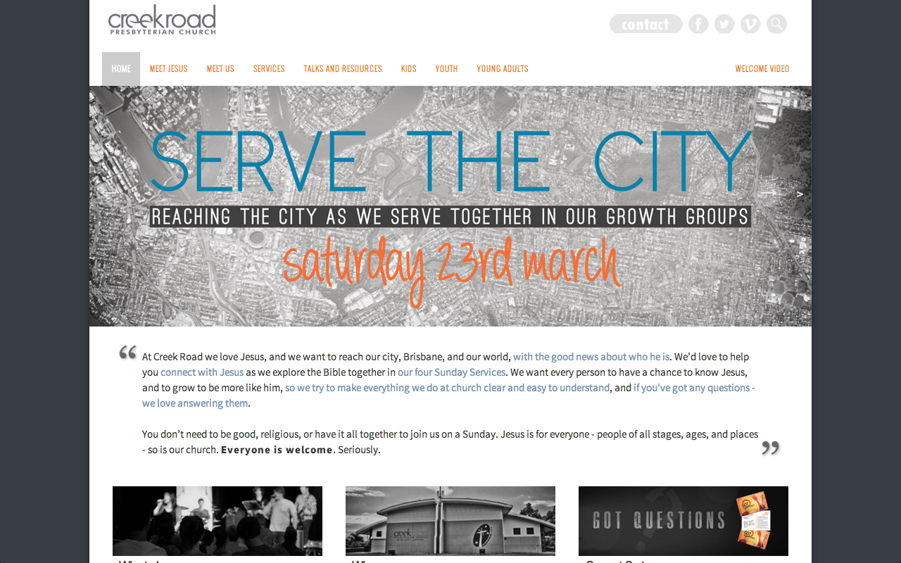
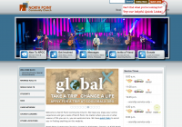
Every hip church on the internet has a slider that features four or five stories. There are good reasons for this. It lets you put a few pictures into one space, and promote a few different things. Pictures are pretty powerful communicators. I’m really keen for this spot to be taken up by pictures of people doing things – things that are obviously related to life at church. A lot of churches put their current teaching series in this slot. I’m not sold on that being obviously important to the new person who may not be a Christian yet – though we know it’s important for them (and hopefully all our sermons are, in some way, related to the good news about Jesus). I’m not sure a gripping ten week teaching series is necessarily what is going to get the majority of non-church, or de-churched, Australians through our doors on a Sunday. And because we’re seeing this as a part of our attempts to connect with people, that is going to be a big factor in what gets featured.
Personally, I can’t understand why you’d use what’s essentially something like a mix between a billboard promoting your church, and the eye-grabbing image on the front page of a newspaper, to do anything other than try to make both the gospel of Jesus and your church appealing to non-Christians.
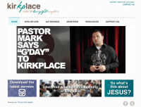
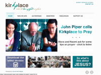
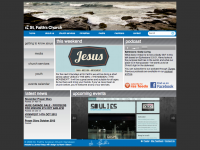
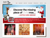
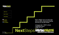
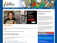
So many of the churches I looked at (some are below) treated their front page like a noticeboard for members, even a well designed noticeboard, and there’d have to be a pretty convincing ecclesiological rationale for doing that before I’d even start to consider that being the purpose of a public site.
Smaller Stories
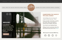
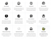
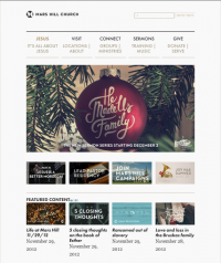
In this section, I’m thinking three columns, but that may change, and probably two rows (check out Mars Hill and Hillsong (though it’s further down the bottom of their page), for what I’m picturing…
In the first row I’m thinking:
1. A 100 word (or less) summary/description of Creek Road’s understanding of the gospel, approach to church, and our understanding of how we relate to Brisbane. This needs to be search engine keyword heavy, because it’s one of the only parts of the front page that features text – and each keyword, or key phrase, should be linked to the page that it relates to – so when we summarise the gospel, that part of the description should be linked to the “what we believe” page, etc.
2. An embedded Google Map, with our church, and a photo of the building so people know what it looks like.
3. A link to invite people to church, with an e-card featuring some info on our current sermon series and links to our presence on social media places.
In the second row I’m thinking:
1. The most recent post from our “consumer” blog.
2. The most recent post from our “resources” blog.
3. A spare spot for things like current releases from our video team, or promotions for carols, our Community Connect school holiday program, our iPhone app if we develop one, etc.
I’m pretty excited about this whole process. It’s a lot of fun bringing my communications hat and my ministry hat together into some sort of twin peaked legionnaire’s cap…
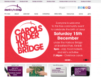
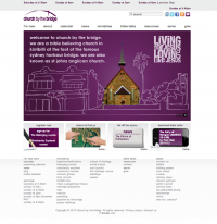
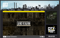
Some of these ideas have been pinched from seeing what I think works on these pages, pages which were selected on the basis that either I thought they have something going for them, or the people who go there/work there have something going for them.
So. Over to you – what are the things you look for in a church page, or think should be included? What do you think visitors are looking for?
Have I missed any essentials?
Can you prove to me that your church web page should be some sort of Community Message Board?
Perhaps most importantly – what can we cut that is just cluttering up the place without damaging the function of the site?