Good posts really good infographics – like this one about the average consumption of meat in the ten biggest meat eating countries (Australia doesn’t make the grade but New Zealand does), and the ten smallest meat eating countries.
The premise is that as countries develop they eat more meat.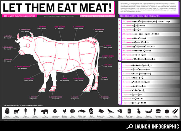
Comments
I think the title is fitting – let them eat meat. I’m surprised Australia wasn’t in the top ten (or am I just blind?)