These aren’t toys. Though they look like it. No. These are art.

This one is called “Leopard with Wilderbeest”

Apparently this is how springbucks “court”

This one is my favourite…

There are more at the sculptor (or knitter?), Jennifer Muskopf’s site.
These aren’t toys. Though they look like it. No. These are art.

This one is called “Leopard with Wilderbeest”

Apparently this is how springbucks “court”

This one is my favourite…

There are more at the sculptor (or knitter?), Jennifer Muskopf’s site.
Did that headline get your attention? Good.
I have an important announcement to make.
My blog is splitting up.
My serious side is divorcing my silly side.
This will hopefully result in less frequent posts here, and a reduction of lengthy boring stuff. You can find the serious stuff at a new domain, one I originally registered because I planned to make thousands of Venn Diagrams. Venn Theology – it’s exploring the overlap between things I’m passionate about – Christianity, Communication, and Culture.
It won’t be as boring as it sounds. Hopefully it’ll be thought provoking and engaging, I’m going to try to up the quality of posts, keeping it as useful as I can, and hopefully making a positive contribution to the broader church with my experience and/or expertise in the realm of marketing and public relations, and I’ll be putting together as many useful resources for ministry, and surviving bible college as I can.
For the next little while the content on Venn Theology will be some old stuff from around these parts refreshed and republished. You can subscribe to Venn Theology’s RSS feed here, and, if you haven’t already – the St. Eutychus feed here.
What this means for St. Eutychus is more of the same, but Cornetto style – no boring bits.
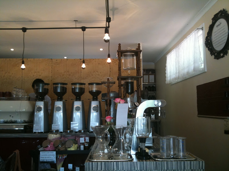
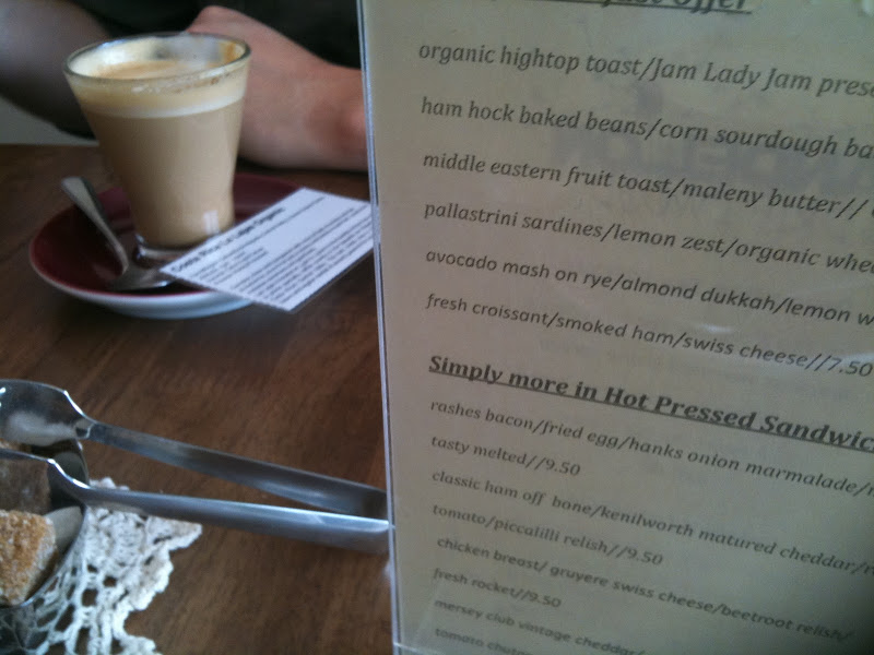
Dandelion and Driftwood is a great little cafe in suburban Hendra. It’s tucked away in a back street, next to an Italian restaurant. Offering a range of brewed coffee varieties, using two blends and two single origins, it’s a simply stunning cafe with a terrific aesthetic. Their website is still under construction, but their Facebook fan page is sensational.
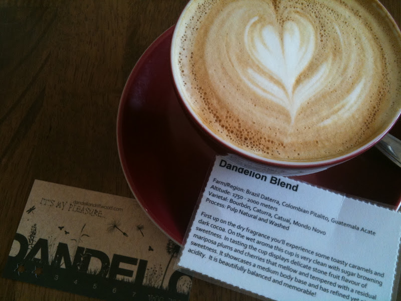
Their design and fitout are immaculate and full of character – as is their coffee. Drinks instore come with a tasting card telling you about the coffee you’re drinking. The staff are dressed in bow ties and aprons. Very schmick.
If you go somewhere offering four beans in four Mazzer grinders you know you’re in for a treat I reckon. And it didn’t disappoint. I think Cup is marginally better, Robyn thought the buttery single origin Costa Rica was sensational, she reckons it was better than the coffee at Cup.
Apologies for the stagnation. My little sister is getting married tomorrow, and I’m preaching on Sunday. So expect it to continue for a couple of days.
I will try to find interesting things to say in the meantime.
Looking for the best coffee in Brisbane? Look no further than Cup, in Russell Street West End. It’s a grungy little warehouse/garage in a side street in West End. A hipster’s paradise (and there were plenty of them around). And the coffee is amazing. So good.
They boast an incredible machine. A Slayer. Which I’ve been excited about in the past (more than once). The Slayer was the first machine to allow changing of pressure during the pouring of a shot.
I discovered Cup a couple of months ago. And was suitably impressed. And Robyn and I checked it out yesterday after I dropped my machine in for a service (which means I’ll be checking out cafes for the next few days).
Cup’s house blend is a rich, sweet and earthy delight. It is so thick and goopy. Viciously viscous. As an espresso it goes straight to the back of your mouth and then explodes. It really is that good.
In milk it’s equally sensational. I had a flat white, Robyn a piccolo latte.
This is their current blend. Featuring a couple of beans I regularly roast and sell.
40% BRAZIL Daterra.
Nice balanced sweetness and body. This is the yellow bourbon varietal from a solid reliable farm.40% GUATEMALA El Injerto.
This is a mixed Cattura and Bourbon coffee from the award winning El Injerto farm. It is very clean and sweet with a nice lime acidity. Always cups up great.20% ETHIOPIA Yirgacheffe.
A new Yirgacheffe thats just arrived adds just a little acid to tie the others together.
Here are our coffees. iPhone style.
The Bold and the Beautiful in 6 minutes. Contains adult themes. And stupidity.
Thanks Cafe Dave.
Like many of the internet generation I’m a fan of Red vs Blue. And I was thrilled to discover that the Red v Blue back catalogue is on YouTube.
I discovered that because I watched this video, made by Rooster Teeth, the guys responsible for Red v Blue… there’s a pretty strong language warning on this one about half way in.
Here, in case you haven’t seen it, is the first episode of Red V Blue – there’s a language warning on it too. It’s a series shot entirely using characters from Halo.
It has been a while since my last typography related post. So here, as my penance, is a list of typographic sins, with examples (in a PDF) for you to mull over. It’s pretty standard fare. But they are good rules for keeping in mind in order to satisfy your pedantic/designer friends…
- Two spaces between sentences.
Repent of this sin by using only one space.- Dumb quotes instead of smart quotes.
Evil: “Thou shalt not misuse type” § Good: “Thou shalt not misuse type”- Dumb apostrohe instead of a smart apostrophe.
Profane: Don’t use prime marks § Sacred: Don’t use prime marks
By the way, apostrophes always face this way: Pot o’ gold.
They never face this way: Pot ‘o gold.- Failing to tuck periods/commas inside quote marks.
Immoral: “I love type so much”, she confessed.
Chaste: “I love type so much,” she testified.
Somewhere in my archives there’s a story about people putting the ideas put forward by XKCD into some sort of real life application. Well. Here’s another example (previous examples include adults filling their lounge room with colourful balls to make their own ball room).

Somebody did this. And you can follow the progress of the eBay robot on Twitter, and read about the source code here with an update here…
The method it uses to select items:
Sounds fun, right? The guy responsible made a couple of changes yesterday:
So far he’s bought some watch batteries, some stickers, and a casio watch. Hooray.
You knew it, and I knew it. We’ve known it for years. Burgers from fast food places don’t look like their ads, in fact the same could be said for all fast food from all fast food places, and in fact, for all food, from all food places… but in order to document what we already knew this guy took photos of the burgers side by side with the photos used in the ads.

The real pay off was that the guy responsible figured out that the ad burgers couldn’t even fit in their real boxes.

How do you thwart a high-tech security system that analyses your fingerprints. In a school. Because all schools need fingerprint scanners… at least according to a school in New South Wales. You stick gummy bears on your fingers.

Yes. Apparently gummy bears can foil most fingerprint scanners. Exciting, no?
From the scientific study of gummy fingers and biometric security systems:
“We also pointed out that artificial fingers can be made not only of silicone but also of gelatin, and examined 11 types of fingerprint systems whether or not they accept the gummy fingers. Consequently, all of these systems accepted the gummy fingers all in their enrollment procedures and also with the rather higher probability in theirverification procedures. The results are enough for us to see evidence that artificial fingers can be accepted by commercial fingerprint systems. The objection will no doubt be raised that it is very difficult to take an impression of the live finger from a legitimate user without the cooperation of her/him. Therefore, we demonstrated that the gummy fingers made from residual fingerprints can be accepted by all of the 11 systems. “
Why do these preachers always sound like they’re hyperventilating?
Via Christian Nightmares.