Nicholson Baker is one of my favourite writers, in part, because of the way he sees intricacies in the mundane that are so easily glossed over. This speech about what it means to write about product design is pretty fun. I think.
Tag: design
A whiteboard guide to designing like Apple
This is pretty nicely done.
Episode 16 – How to Design Like Apple from Minute MBA by OnlineMBA.com on Vimeo.
By Minute MBA, Via @Communic8Jesus
Reviewing Steve Jobs: Not the Messiah, just a naughty boy
I did a little bit of flying during the last weekend – and I’m rubbish at writing at airports and on planes, so I chose to do some reading. My book of choice was Walter Isaacson’s fascinating biography of Steve Jobs.
It was an interesting read, the carefully cultivated messianic myth came up against an access all areas account of Steve’s life. He was, as it turns out, a nasty and deliberate man. He had an incredible knack for understanding people and culture and using that to his advantage. This worked in his favour in business, he was constantly ahead of the curve – able to anticipate desires before we knew we had them. That was one of his significant mantras – people don’t know what they want until you give it to them. But this same ability meant that he was able to crush people, and did, just for kicks. He had poisonous relationships with lots of people who used to be his friends, and with members of his family, because he believed the myth. Essentially. He believed he was different, that he was special, and that his vision would change the world. And while he fostered a culture of robust discussion, and could have his mind changed, he’d immediately take the ideas of others and claim them as his own.
This is a fascinating exercise in anti-hagiography. It’s not a victor’s history. It’s a picture of a deeply flawed man who embraced his flaws to change the world. Like him, or hate him, and it’s hard to love him after reading this book… Jobs changed many industries, designed products that are being copied by all sorts of other people, and brought a new approach to business, especially the computer business, where everything was managed by one company (ie hardware design, manufacture (to an extent), software, retail, post retail (by providing a closed system). The open systems v closed systems thread that ran through the book, and Jobs’ interactions with Bill Gates provided an interesting picture into Silicon Valley and the technology we use. I enjoyed that. I learned lots. There are things Jobs did that are definitely not things I’d want to implement in my home life, or in my church life, but his pursuit of excellence, and his unrelenting confidence in the “truth” even in the face of opposition and rejection were in a sense, inspiring.
The great thing about the book was that it totally humanised Jobs. He was flawed. He wasn’t Nietzsche’s Übermensch, even if that was his self perception for a while. He wasn’t particularly smart – outside of his industry (and even within it) he did some really dumb stuff, that wasn’t skirted around in the book, it was a no-holds-barred treatment of his life. An example of his less than optimal decisions included not treating his cancer because he believed he could get rid of it just by drinking juice and applying some internet remedies. While he wasn’t particularly likeable, he had some redeeming features, and he was passionate. He was human. He was vulnerable. He wasn’t the messiah, just a naughty boy.
It was kind of sad that the tone of the book, and the editorialising at the end, seemed to excuse some of Steve’s behaviour on the basis of his achievements, as though the ends justified the means. It’d be interesting to hear from Steve’s neglected children, and from the friends and colleagues he left scattered in his wake, in twenty years – to see if they agree. There was a very real human cost to his decision to build a life around himself and his vision.
He told his biographer, in the months before he died, that he was “50-50” on the question of God. He wanted there to be something else. He seemed to think his achievements would be works that God might judge him on. Apparently his last words were “oh wow, oh wow, oh wow” at least according to his sister’s more hagiographic eulogy (but who doesn’t say nice things at that point).
Here are some of the snippets from the book that I thought were particularly interesting insights from a man gifted with the ability to make particularly interesting insights…
On God…
“Reflecting years later on his spiritual feelings, he said that religion was at its best when it emphasized spiritual experiences rather than received dogma. “The juice goes out of Christianity when it becomes too based on faith rather than on living like Jesus or seeing the world as Jesus saw it,” he told me. “I think different religions are different doors to the same house. Sometimes I think the house exists, and sometimes I don’t. It’s the great mystery.””
And later…
“I’m about fifty-fifty on believing in God,” he said. “For most of my life, I’ve felt that there must be more to our existence than meets the eye.” He admitted that, as he faced death, he might be overestimating the odds out of a desire to believe in an afterlife. “I like to think that something survives after you die,” he said. “It’s strange to think that you accumulate all this experience, and maybe a little wisdom, and it just goes away. So I really want to believe that something survives, that maybe your consciousness endures.””
On designing with the end user(s) in mind…
““If it could save a person’s life, would you find a way to shave ten seconds off the boot time?” he asked. Kenyon allowed that he probably could. Jobs went to a whiteboard and showed that if there were five million people using the Mac, and it took ten seconds extra to turn it on every day, that added up to three hundred million or so hours per year that people would save, which was the equivalent of at least one hundred lifetimes saved per year. “Larry was suitably impressed, and a few weeks later he came back and it booted up twenty-eight seconds faster,” Atkinson recalled. “Steve had a way of motivating by looking at the bigger picture.””
On Apple’s Design philosophy…
“Apple’s design mantra would remain the one featured on its first brochure: “Simplicity is the ultimate sophistication.” Jobs felt that design simplicity should be linked to making products easy to use. Those goals do not always go together. Sometimes a design can be so sleek and simple that a user finds it intimidating or unfriendly to navigate. “The main thing in our design is that we have to make things intuitively obvious,” Jobs told the crowd of design mavens. For example, he extolled the desktop metaphor he was creating for the Macintosh. “People know how to deal with a desktop intuitively. If you walk into an office, there are papers on the desk. The one on the top is the most important. People know how to switch priority. Part of the reason we model our computers on metaphors like the desktop is that we can leverage this experience people already have.””
On Marketing…
““The Apple Marketing Philosophy” that stressed three points. The first was empathy, an intimate connection with the feelings of the customer: “We will truly understand their needs better than any other company.” The second was focus: “In order to do a good job of those things that we decide to do, we must eliminate all of the unimportant opportunities.” The third and equally important principle, awkwardly named, was impute. It emphasized that people form an opinion about a company or product based on the signals that it conveys.”
On applying this philosophy even to the smallest of things…
“People do judge a book by its cover, so for the box of the Macintosh, Jobs chose a full-color design and kept trying to make it look better. “He got the guys to redo it fifty times,” recalled Alain Rossmann, a member of the Mac team who married Joanna Hoffman. “It was going to be thrown in the trash as soon as the consumer opened it, but he was obsessed by how it looked.” To Rossmann, this showed a lack of balance; money was being spent on expensive packaging while they were trying to save money on the memory chips. But for Jobs, each detail was essential to making the Macintosh amazing.”
First Person Umbrella
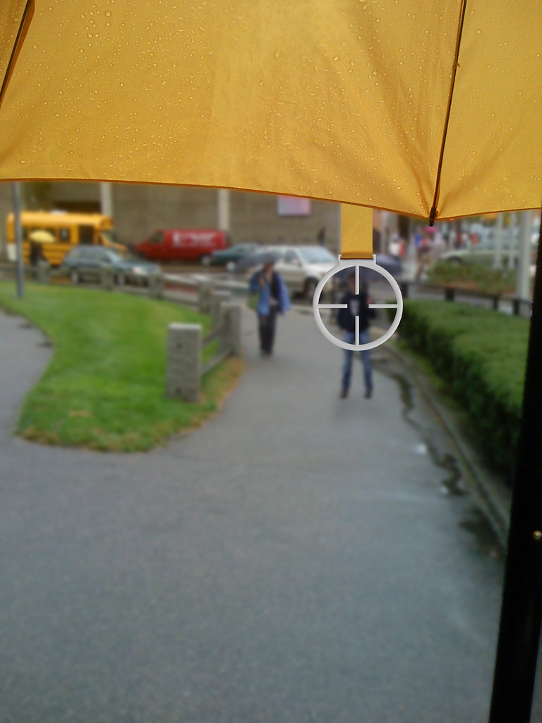
Sick and tired of the great unwashed. Tired of slow walkers. Or worse, public smokers… well. Use this umbrella, and your imagination, to blow them away.
From the blurb on Flickr.
“Around Harvard you can tell the MBAs in the rain because they’re the ones with the giant umbrellas. Those are are nice about it raise their umbrella and generally play well with others on the sidewalk. The jerks are the ones who barge through the city hitting the umbrellas of others at will.
It’s because of them that I’ve invented the Urban Combat Umbrella which lets you exact virtual revenge by putting them in your sights and making shooting noises until you heart’s content.”
Some initial thoughts on Facebook’s Timeline
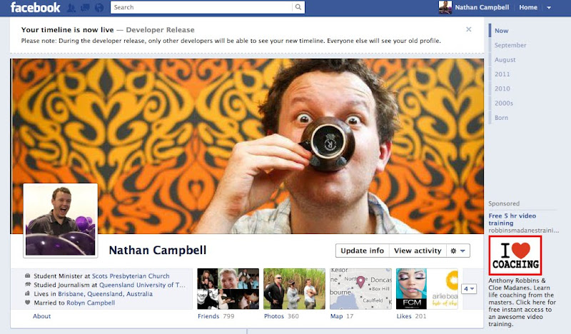
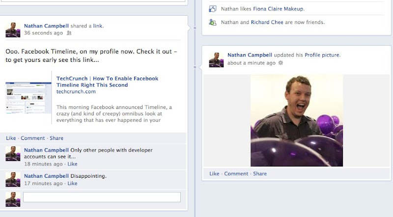
There’s a shortcut doing the rounds. You have to be a Facebook developer, which is incredibly easy. And only other developers will be able to see your new profile until they’re made public (you can sign up to get one when they’re made public here).
Facebook Timeline looks impressive. Don’t believe me? Let Don Draper convince you… That video is a mashup of a Mad Men pitch for a Kodak product and details about Facebook’s new profile format. It was created by a guy named Eric Leist.
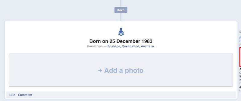
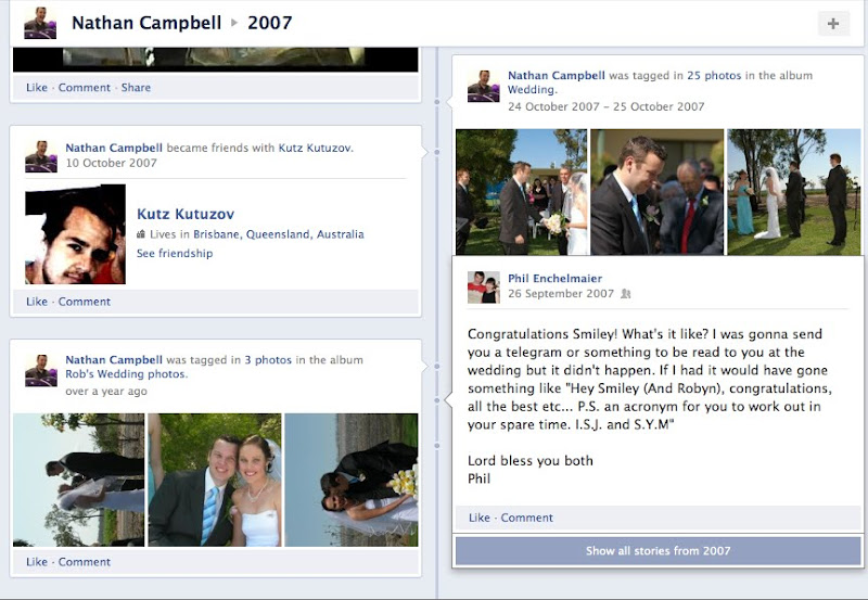
I’ve got to say – I like these changes and this new design more than I’ve liked anything Facebook has done before, change wise. I’m not one of those people who complains about redesigns. I mean. Look what Facebook looked like when it launched. Navigation is intuitive – and it’s fun looking back through my own story, I’m looking forward to browsing through other peoples’ histories too. That’s what Facebook is for. Right?
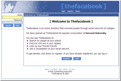
Anyway, here are some shots from my sneak peak.
This is a “summary” of photos I was tagged in in September.
And places I visited.
Pretty nifty.
A significant time…
This could be game changing for businesses and churches in terms of creating content with some legacy value, there’s something nice about having an entity’s history there to play around with.
Philosophies as minimalist posters
Minimalism is one of my favourite design and communication philosophies. You wouldn’t necessarily know it from reading my blog, I know. But I love simplicity. And clarity. And the clarity that comes from simplicity. Getting complexity into simplicity and maintaining clarity is the holy grail of communication.
Anyway. Here are some posters. About philosophical worldviews. And they’re as minimalist as it gets. And they’re nice. The series is tagged “posters explaining complex philosophical theories through basic shapes.”


They’re posters from Genis Carreras, you can check them out/buy them here.
A stich in time: the knitting clock
This is quite brilliant. Every year produces a knitted 2 metre scarf. Designed by Siren Elise Wilhelmsen.

It goes through one ball of yarn a year, so it’s both clock and calendar. In a way. But the downside is you’re always wearing last year’s fashion.
Powerpoint horror stories: some of the world’s worst slides
Urgh. There’s no greater design faux pas than an overloaded powerpoint. Especially an overloaded powerpoint with wordart.
Do your powerpoint slides look like this? I hope not. I tell everybody that the people who read my blog have class and intelligence. Not to mention taste. So lets all laugh at these people together. It’s the only way they’ll learn.


Infocus ran this competition to find the world’s worst slides, and provided these tips for not finding yourself on that list.
How to use a letterpress
There’s something really nice and classy about this video.
Letterpress from Naomie Ross on Vimeo.
Makes me yearn for simpler times and simpler tastes.
Spotted first on 22 Words.
Say it with style: Letterpress Cards
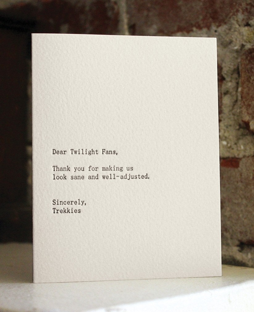
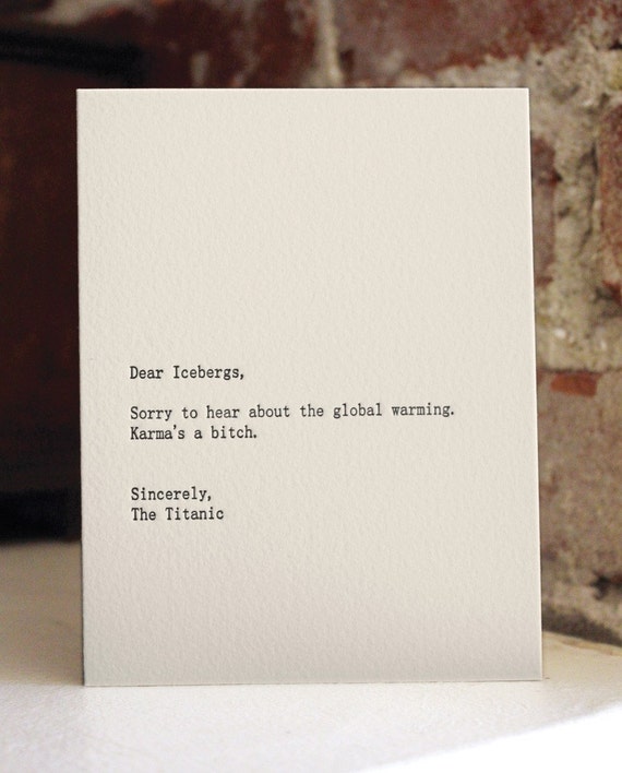
Dear ____, from ____ templated jokes are one of those little internet memes you probably haven’t heard of and I don’t care about. Or you might have. I don’t know. There’s a tumblog somewhere. Most of them aren’t funny.
But these are kind of clever.

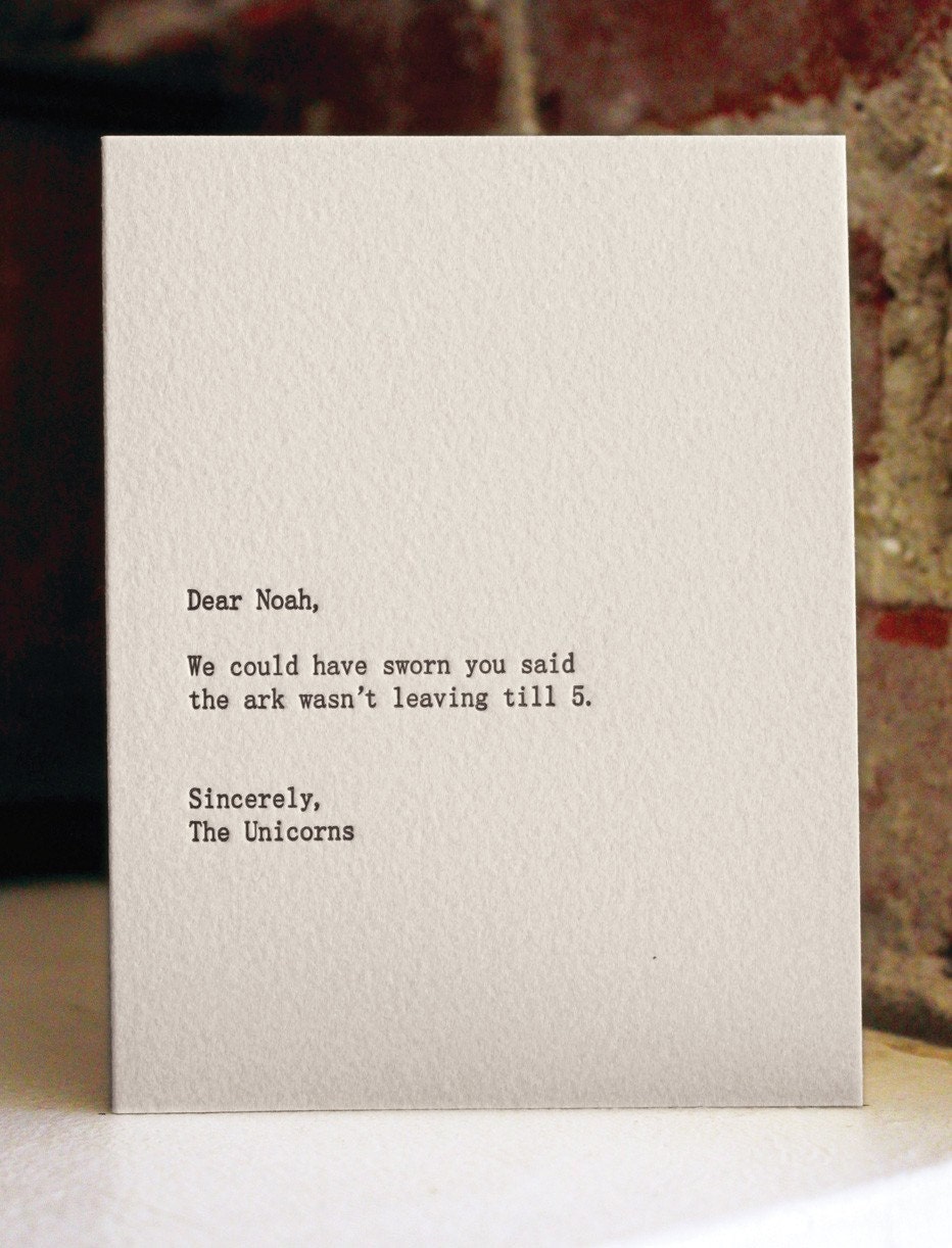
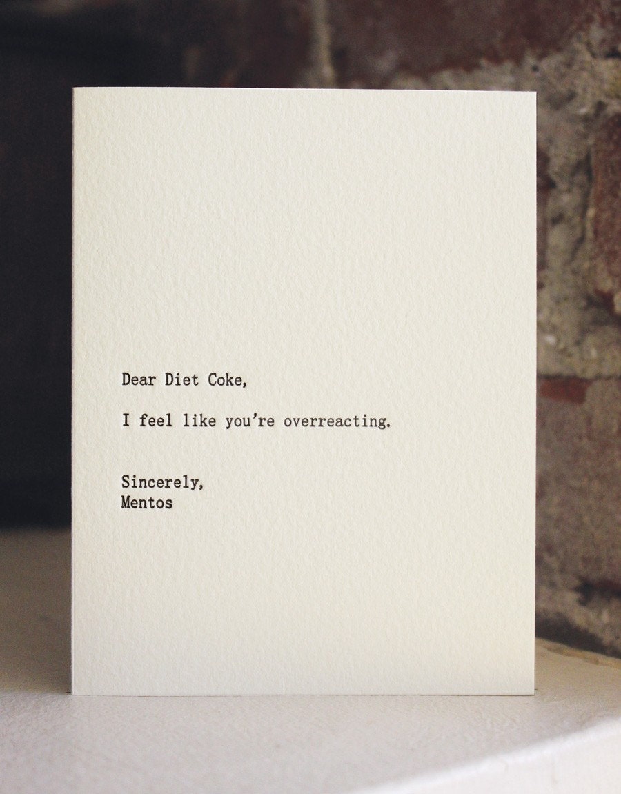
Mmm. Type Sandwiches
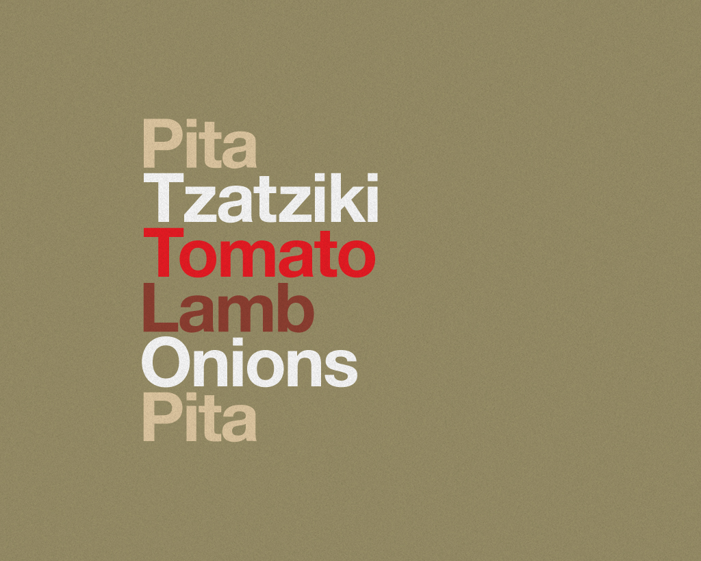
This brings some of my favourite subjects together – typography, Helvetica and burgers. Delicious mix.
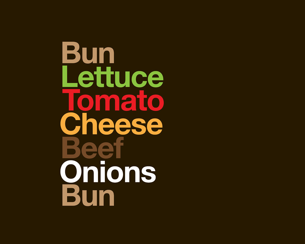
Via this Flickr set. There are more sandwiches there. But I love this one:

And this one:
The Human Project
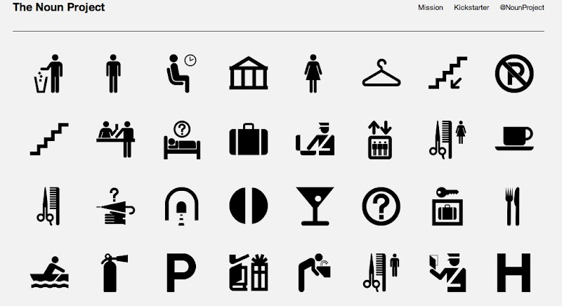
If you liked the noun project – but would like your nouns with a little more narrative – then the Human Project might be worth watching, it’s one designer’s quest to explain globally recognised pictograms.


Font of knowledge: A collection of font resources
Right. More font stuff to clear from my set of open tabs… Hopefully you’ll find these interesting or useful.
Here’s an “anatomy of a typeface” picture to examine so that when you read about fonts you know what’s going on.
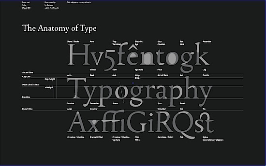
It’s from Font.is. You can get it in wallpaper size here.
I tend to stick with Helvetica as a user friendly sans serif for the web, and Georgia for serifed fonts (like on this site – at the moment). But if you want to stand out from the crowd (though arguably a Times derivative and Arial are the fonts of the masses). Then here are some alternative serifs, and sans serifs, for you to consider.
If the idea of matching fonts seems daunting to you – and it should… Because golden rule for graphic design and fonts #1 is don’t mix too many fonts… then you should check out Smashing Magazine’s guide to choosing fonts. It’s a five point list. One of the points is “know your types” – did you know fonts can be described in the following classes:

This little snippet on how to use fancy fonts (like the one in my header on St. Eutychus). The answer: sparingly.
Periodically, there’s a need for a font that oozes with personality, whether that personality is warehouse party, Pad Thai or Santa Claus. And this need brings us into the vast wilderness of Display typefaces, which includes everything from Comic Sans to our candy-cane and bunny fonts. ‘Display’ is just another way of saying ‘do not exceed recommended dosage‘: applied sparingly to headlines, a display font can add a well-needed dash of flavor to a design, but it can quickly wear out its welcome if used too widely.
Good stuff. Keep it on file.
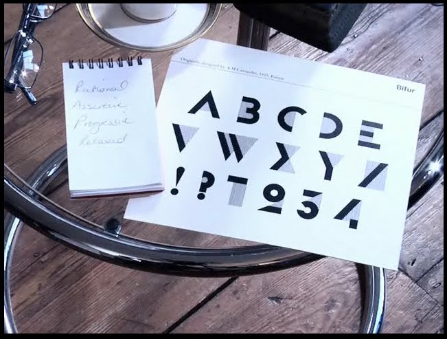
Then find out what font you are using this video quiz. Apparently I am Bifur.
News headlines posterised
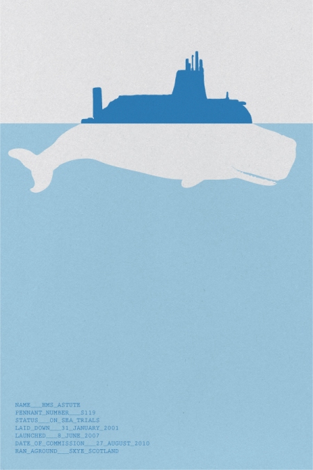
This is cool. Some guy named Johnny Selman is turning news headlines into posters hoping to encourage more people to follow the comings and goings on the global stage.
Some samples:
“ANARCHISTS BLAMED FOR ROME EMBASSY BOMB ATTACKS”

“NUCLEAR SUBMARINE HMS ASTUTE RUNS AGROUND OFF SKYE”
