Tag: infographics

Choose your own adventure – easier with a map

I loved Choose Your Own Adventure books as a young’un. Though, being a Campbell, I was a pretty bad cheat and used to do them backwards after a couple of frustrating deaths.

Perhaps I would have made better choices had I studied the structure of the books in depth. Like this person has.

In scanning over the distribution of colors in this plot, one clear pattern is a the gradual decline in the number of endings. The earliest books (in the top row) are awash in reds and oranges, with a healthy number of ‘winning’ endings mixed in. Later cyoa books tended to favor a single ‘best’ ending (see CYOA 44 & 53).

And here’s something I did not know, and indeed it contains a life lesson for those of us who like to cheat…

The one outlier is the catastrophic ending seen in the third row from the bottom. This was a punishment page that could only be reached by cheating. Unlike most other endings in the book it does not offer to let you continue the story from a few pages back but instead calls you a cheater and leaves you with no choice but to start over from the beginning.

Apparently the books evolved to become more difficult over time. As indicated by this graph…

Read the rest of the research. It’s interesting.
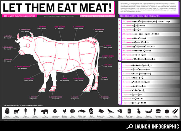
Peak Rock

There seems to be a strange correlation between oil production in the United States and the production of good music (as qualified by Rolling Stone magazine).

“First, a little theory. The decline in U.S. oil production* is explained by the Hubbert Peak Theory, which states that “the amount of oil under the ground in any region is finite, therefore the rate of discovery which initially increases quickly must reach a maximum and decline.” Makes sense, right? The same theory can apply to anything of a finite quantity that is discovered and quickly exploited with maximum effort.

Including, it would seem, rock & roll. I know, the RS 500 list is not without its faults, but it does allow for some attempt at quantifying a highly subjective and controversial topic and for plotting the number of “greatest songs” over time. Notice that after the birth of rock & roll in the 1950’s, the production of “great songs” peaked in the 60’s, remained strong in the 70’s, but drastically fell in the subsequent decades. It would seem that, like oil, the supply of great musical ideas is finite. By the end of the 70’s, The Beatles, Led Zeppelin, Black Sabbath, the Motown greats, and other genre innovators quickly extracted the best their respective genres** had to offer, leaving little supply for future musicians.”

Via Good.

Jobs for the boys

The New York Times has an infographic today exploring the impact of the GFC on different age groups and demographics in America. It’s pretty fascinating. But it probably doesn’t directly translate to employment in Australia.

Men in America are sitting at an unemployment rate of 9.0% across all demographics, while women are at 7.3%.

College graduates fair remarkably better than non-college graduates, and people over 45 report much better employment rates than younger workers.

I assume this looks at people who want to be in work and aren’t though. Which is the traditional measure of unemployment – despite what some stupid government departments might suggest. Yeah, I’m looking straight at the ones who take the total workforce and subtract it from the total population…

If it did I’d be fairing well – as would people like me – with only 3.9% of white, 25 year old (and over) males with university degrees looking for work.

Find out how you score here.

Apostrophic flow chart

If you’re still struggling with apostrophe use check out apostrophe.me for a series of flow charts and nicely explained graphics. Here are some of them. There are a couple more.

Here’s the golden rule of apostrophe use.

You do the map, you do the movie map

The image below may seem almost illegible. In fact, it no doubt will… but click it (or here) and you’ll get a subway map of blockbuster movies. It’s clever.

What a super-coloured-flagilistic-explanation-this-is

This is one awesomely detailed infographic.

"Using a list of countries generated by The World Factbook database, flags of countries fetched from Wikipedia (as of 26th May 2007) are analysed by a custom made python script to calculate the proportions of colours on each of them. That is then translated on to a piechart using another python script. The proportions of colours on all unique flags are used to finally generate a piechart of proportions of colours for all the flags combined. (note: Colours making up less than 1% may not appear)"

How to write a book

One day I’d like to write a book. With the help of the character guide I posted a while back, and this helpful plot flow chart, my dream is a step closer to reality…

Gold diggers

We (Australians) ain’t nothing but a bunch of gold diggers. It turns out Australians are all rejoicing about our golden soil, and the national wealth for work equation.

Australians, according to the Economist, have the most positive self image.

It’s with good reason because figures just released show that we’re also the second most desirable country to live in, based on the range of factors considered by the United Nations Human Development Index… behind Norway.

The lights are on

In America the furthest point between two McDonalds restaurants is 145 miles by road. If you plotted every golden arch on a map it would look like this…

And we know this thanks to this guy, via Strange Maps.

Downward mobility

How many mobiles have you owned? Me, I’ve had six (plus my two current iPhones). That’s a lot. But I didn’t really feel guilty until now…

Via here.

One stop informercial shop

Remember those really exciting little videos about technology these days? You know, the ones that boggle your mind with the sheer size and amount of information floating around. Figures like the ones in this picture (found here):

Here are a bunch of the videos, including a couple I hadn’t seen before, in one easy post. Watch them before your next dinner party.

Oscars and Lucinda

So you’re producing a movie. You want it to win an Oscar. Where should you set it? It’s one of life’s great questions.

A question finally answered by this infographic.

If you were writing a movie about the sugar industry you could set it in North Queensland, in Lucinda, and this title would then make sense.

Here’s a picture of Lucinda.

From here, via bookofjoe.

Meaty graphic on relative prosperity

Good posts really good infographics – like this one about the average consumption of meat in the ten biggest meat eating countries (Australia doesn’t make the grade but New Zealand does), and the ten smallest meat eating countries.

The premise is that as countries develop they eat more meat.

Print preview

The Internet is big. Remember those posts about what it would look like if you printed wikipedia – or just the featured articles.

Here are some infographics about what it would look like, and take, to print the whole shebang. Probably including my blog. It’s like, totally on the Internet man…

There are a couple more of those here.

Plane Truths

Have you ever wondered why cheap airlines are so much cheaper than the others? They must cut corners right? Of course they do. Some of the corners are more obvious than others. But they make cuts just about everywhere. Check out this infographic on Flickr for proof…

Found via Gizmodo.