Tag: typography

How fonts are like churches…

Here’s a cool video about font maestros Hoefler and Frere-Jones. It’s a nice look at what goes into the making of a typeface.

I love this quote.

“I thought going into this that it would be very hard to defend the need for new typefaces. They seem like an extravagance. A vanity. What I’ve discovered in practice is that most typefaces don’t work perfectly well with different types of content out in the world, and the need to speak in different ways… I think there’ll always be a need for new typefaces.”

FacedType: Typecasting typefaces

I made a new blog. It’s very much a work in progress. Mostly because I need someone who can draw. I’m thinking that fonts are like actors. They’re perfect for playing some roles and obviously miscast in others. Which is great. Because the language of type lends itself to such an interpretation.

When I’m trying to pick a font I like to think of my publication/purpose in terms of a type of person or profession, and then I match the font to that. This is pretty much the premise driving FacedType.

e.g

Papyrus: A Vegas Casino Egyptian Character. Not really authentic, but what people think might be authentic.

If you can draw and would like to make me little cartoon caricatures for these fonts I’m sure we could make a book, or trading cards, or some sort of splash on the internet. If you can think of a two or three line description of the type of actor/role typified by a font. Let me know.

Check it out (I’ll be moving it over to facedtype.com at some point in the near future).

How to use a letterpress

There’s something really nice and classy about this video.

Letterpress from Naomie Ross on Vimeo.

Makes me yearn for simpler times and simpler tastes.

Spotted first on 22 Words.

A handy font

Meet Handschrift.

Handschrift is a font some people made when they were bored and had access to a photocopier.

The “symbols” palette is pretty cool.

More at Behance.

Typographic Scrabble

I’d like one of these Scrabble sets if ever they become a reality.

So why don’t you head along to designer Drew Capener’s website and let him know you’d like one via his little form.

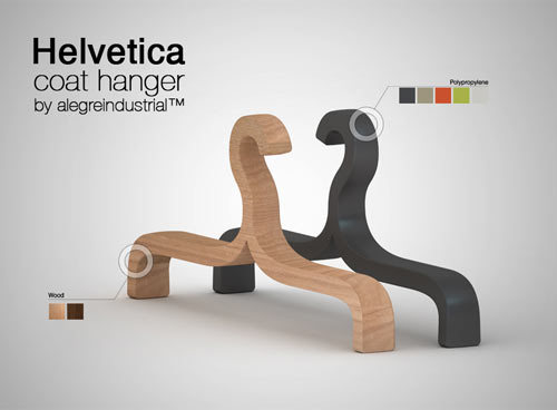
Helvetihangers: Hang your clothes in typographic style

? + { + ] = a coathanger. In Helvetica.

From Alegre Industrial (their blog is in Spanish).

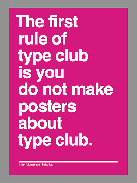
The first rule of type club…

The first rule of Type Club is you do not make posters about Type Club.
The second rule of Type Club is you do NOT make posters about Type Club.
If someone says stop, goes limp, taps out, the critique is over.
Two typefaces at most in a composition.
One project at a time.
No Comic Sans, no Papyrus.
Sketching will go on as long as is has to.
If this is your first night at Type Club, you have to Type.

From I Like Type.

Mmm. Type Sandwiches

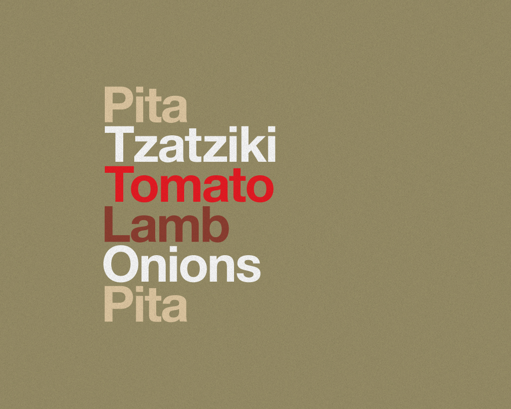
This brings some of my favourite subjects together – typography, Helvetica and burgers. Delicious mix.

Via this Flickr set. There are more sandwiches there. But I love this one:

And this one:

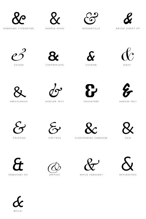
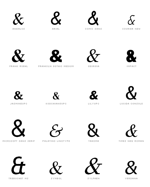
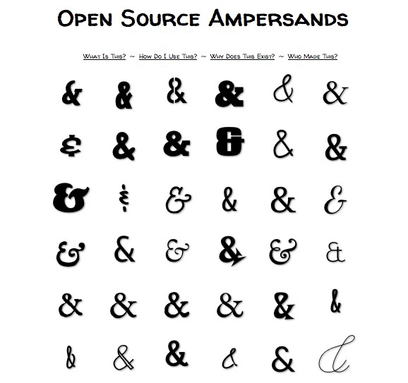
Know your &s

Did you know that the ampersand (&) was originally meant to be an e and t joined together. From the Latin et? Did you know that typographers love the &? Did you know you can judge a font by its &?

If you answered “no” to any of those questions then you need to get your & on. So. Check out these & resources.

You can, using a little bit of CSS, serve up fancy &s to visitors to your webpage. Here’s how (and it’s the source of these graphics).

Here are the &s available on Mac…

& on PC…

You can also, if you’re technologically inclined, install some webfonts. This site has a bunch. Here’s a sample.

Typographic Portraits

I like these typographic portraits, especially Mr T and Gandhi.


Image Credit: Captain Bone Daddy, Deviant Art


Image Credit: Dencii

I might even try to make one. There are some tutorials (one, and two) on that post. It looks amazingly easy.

To space or double space, that is the question

When it comes to how to begin a new sentence, I’m a proud single spacer. I have been for as long as I can remember, even though I have vague memories of being taught to double space when learning to handwrite in primary school. Turns out I’m in the right.

Don’t believe me? Read this slate article.

“Every modern typographer agrees on the one-space rule. It’s one of the canonical rules of the profession, in the same way that waiters know that the salad fork goes to the left of the dinner fork and fashion designers know to put men’s shirt buttons on the right and women’s on the left. Every major style guide—including the Modern Language Association Style Manual and theChicago Manual of Style—prescribes a single space after a period. (The Publications Manual of the American Psychological Association, used widely in the social sciences, allows for two spaces in draft manuscripts but recommends one space in published work.) Most ordinary people would know the one-space rule, too, if it weren’t for a quirk of history. In the middle of the last century, a now-outmoded technology—the manual typewriter—invaded the American workplace. To accommodate that machine’s shortcomings, everyone began to type wrong. And even though we no longer use typewriters, we all still type like we do. (Also see the persistence of the dreaded Caps Lock key.)”

Alphabet Soup: The alphabet in fonts

I like this.

The Alphabet from n9ve on Vimeo.

Via 22 Words.

Book Review: Just My Type

I just finished reading what I think is possibly the best book you’ll read on Fonts and typography. You’ll laugh, you’ll cry, it’ll change your life… it changed the font here on St. Eutychus. I decided I was bored with Georgia and switched to Palatino. They look almost indistinguishable.

The book takes an entertaining walk down memory lane, stopping to study different fonts – as though they’re shopfronts – along the way. It makes the most of the Interweb’s collective fascination with typography – featuring the type of thing you’ve no doubt encountered here and elsewhere (including a vivid description of Max Kerning).

You’ll learn fun facts about Helvetica and Arial, the history of Futura, German blackletters, old school printing press movable type… how fonts are designed. You won’t regret it. Promise.

If you’ve ever been curious about the world of type but not known how to dip your toes in – or if you’re a bona fide expert who knows your baskerville from your goudy old style – then check it out. It’ll no doubt provide some good blogging fodder over the next few days before I return it to my dad. Who I borrowed it from.

Book Depository Link | Amazon Link

Of quick foxes and lazy dogs

I’m reading a book about fonts at the moment. A fairly long, and well written, entertaining book about fonts. It’s called Just My Type (Amazon). It pointed me to this video on YouTube:

And then mentioned that most fonts these days can be carefully examined using these two one word options:

Handgloves

or

Hamburgers.

Apparently all the rises, falls, and curves of the significant letters in a typeface can be tested in those two words. So there’s really no need for the fox after all.

Typographic Sins

It has been a while since my last typography related post. So here, as my penance, is a list of typographic sins, with examples (in a PDF) for you to mull over. It’s pretty standard fare. But they are good rules for keeping in mind in order to satisfy your pedantic/designer friends…

  1. Two spaces between sentences.
    Repent of this sin by using only one space.
  2. Dumb quotes instead of smart quotes.
    Evil: “Thou shalt not misuse type” § Good: “Thou shalt not misuse type”
  3. Dumb apostrohe instead of a smart apostrophe.
    Profane: Don’t use prime marks § Sacred: Don’t use prime marks
    By the way, apostrophes always face this way: Pot o’ gold.
    They never face this way: Pot ‘o gold.
  4. Failing to tuck periods/commas inside quote marks.
    Immoral: “I love type so much”, she confessed.
    Chaste: “I love type so much,” she testified.